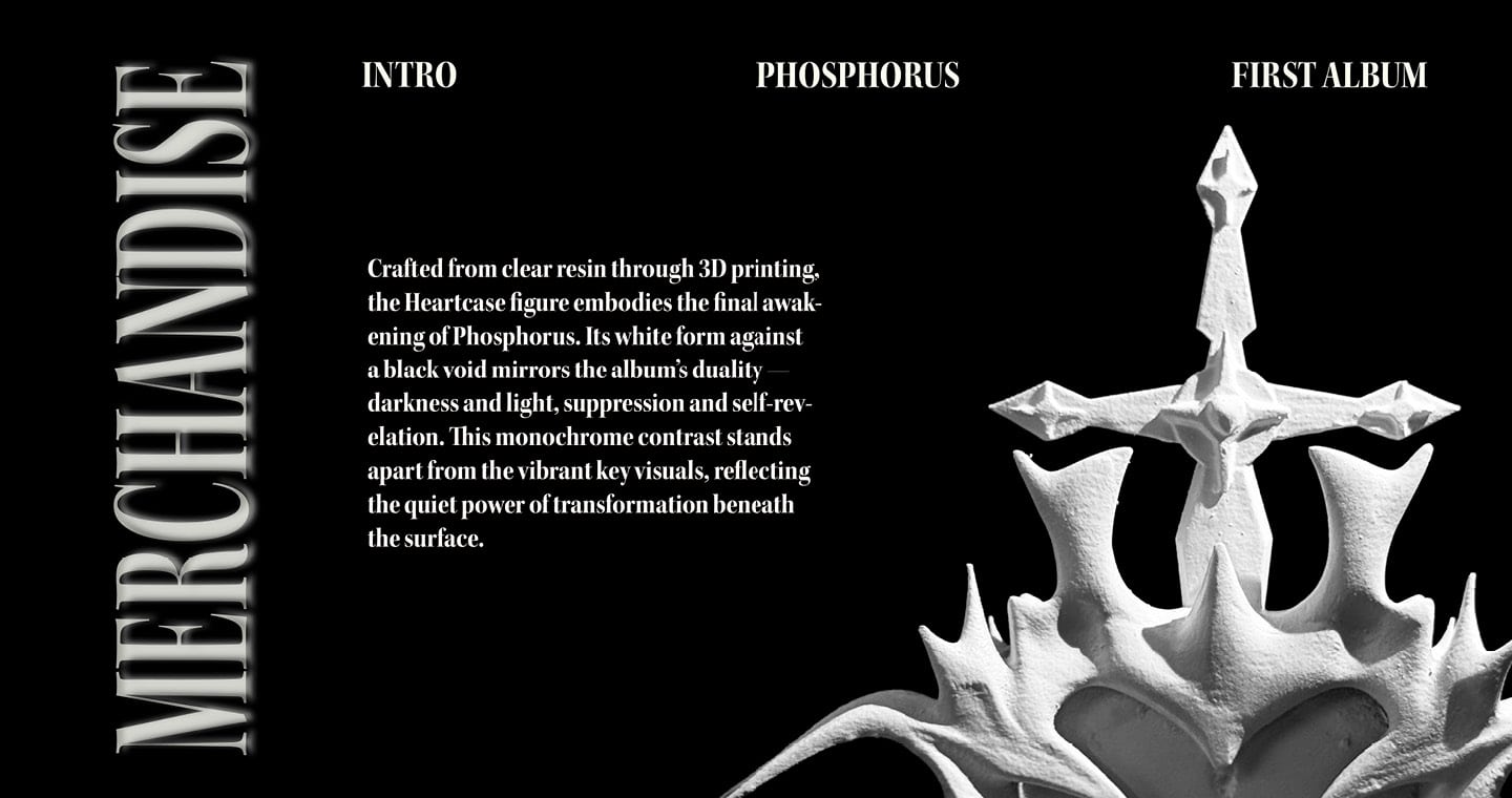
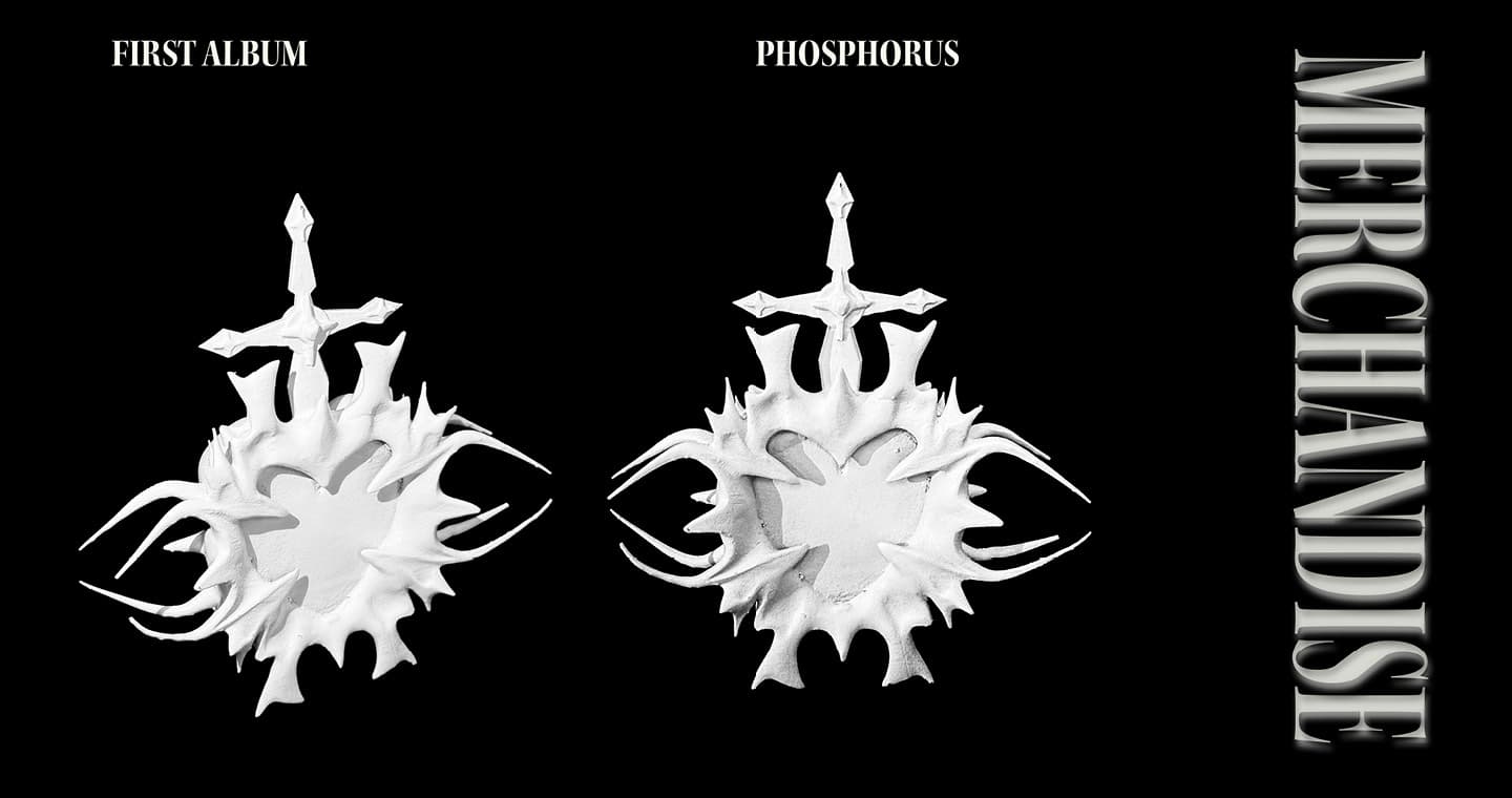
“PHOSPHORUS” – MORNING STAR:
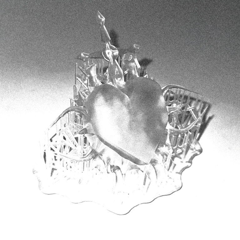
3D KEY VISUALIZER:
ALBUM NAME:
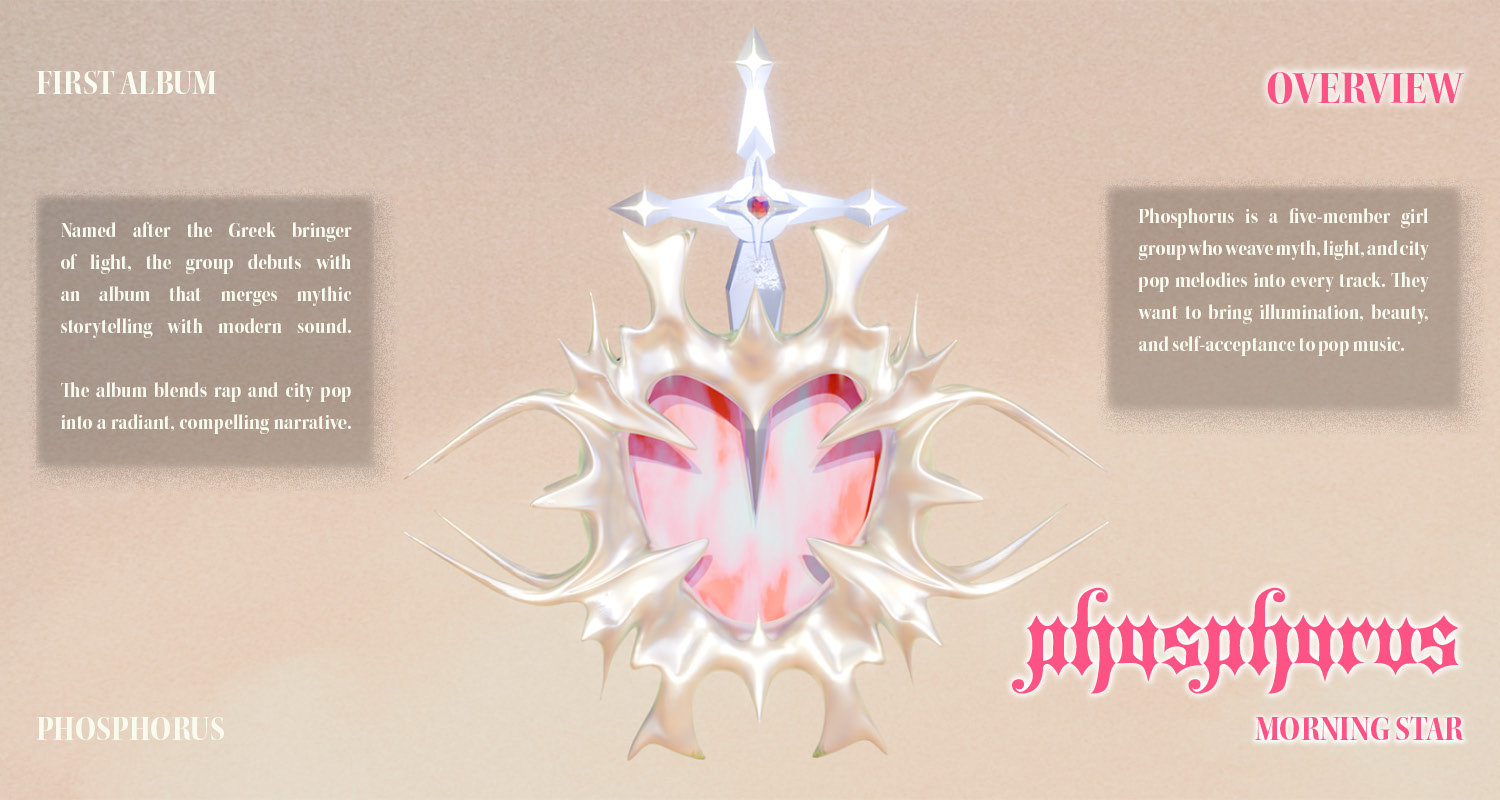
The name Phosphorus draws inspiration from the Greek god personifying the Morning Star, symbolising the “bringer of light.” Derived from the Greek Phōsphoros—meaning “torchbearer” or “light-bringing”—the name reflects notions of illumination and revelation (from phōs, “light,” and pherein, “to carry”) (theoi, 2017). In Greek mythology, Phosphorus, son of Eos (the Dawn) and Astraios, was later merged with his counterpart Hesperus, the Evening Star, as both were recognised as the planet Venus. Often depicted in vase paintings as a radiant youth crowned with a halo or holding a torch, Phosphorus embodies beauty, enlightenment, and duality—concepts central to the album’s narrative (theoi, 2017).
ALBUM CONCEPT:
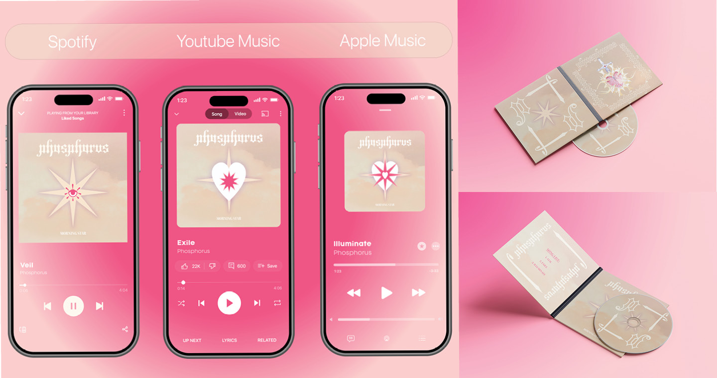
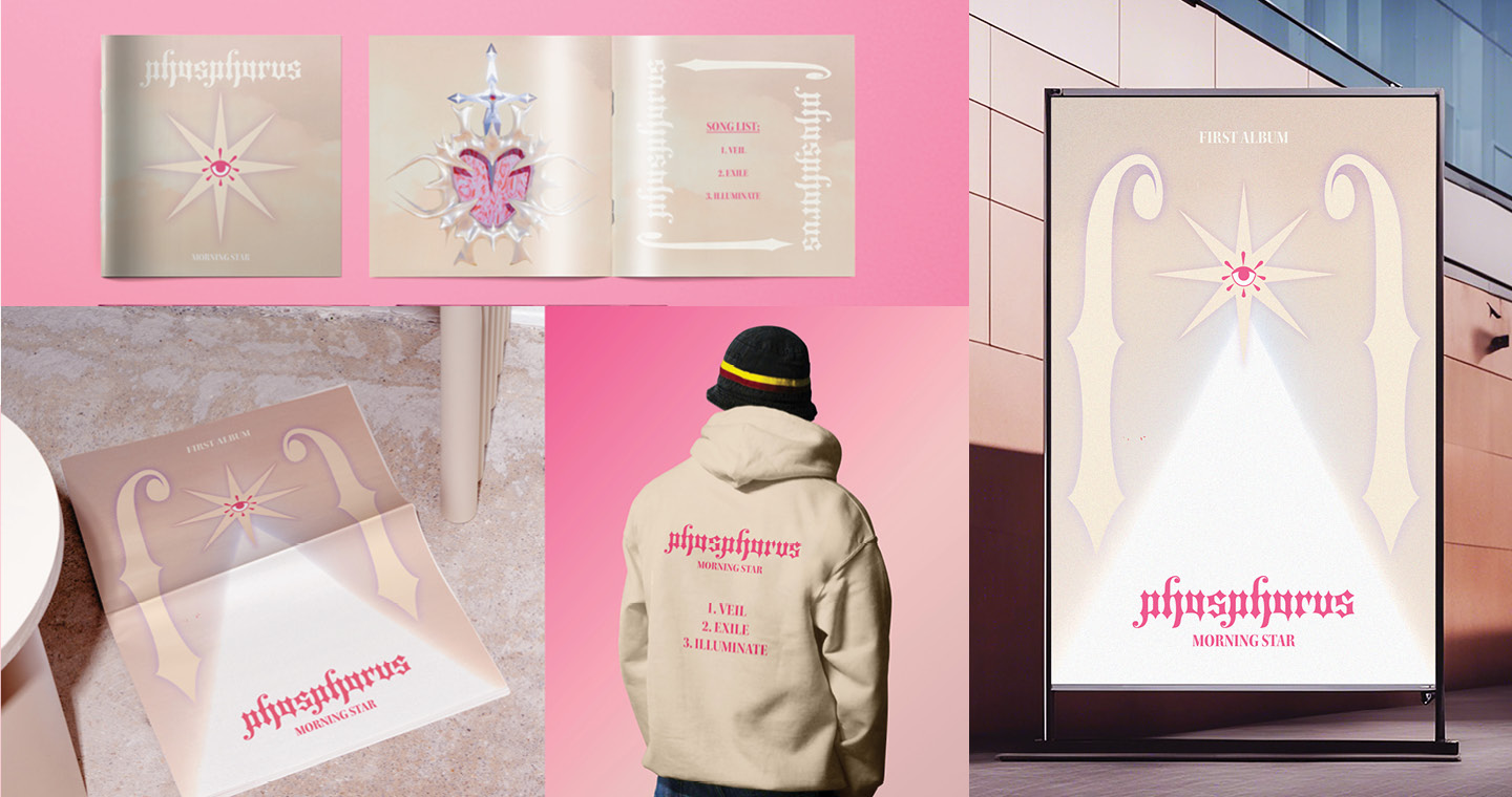
Phosphorus emerges as a bold new voice in the K-pop rap/trap scene with their debut album Phosphorus. Taking their name from the Greek “light-bringer”: the morning star, child of Dawn. Across three stages represented in the album’s three songs: Veil, Exile, Illuminate, the album follows the journey of a young witch who learns that her true power is not in hiding but in embracing her difference. With heavy bass, sharp flows, and surreal aesthetics, Phosphorus shines as a guiding light for a generation confronting insecurities, igniting confidence, and celebrating unapologetic self-acceptance.
BRAND MARK DESIGN:
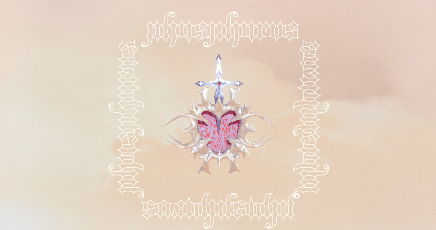
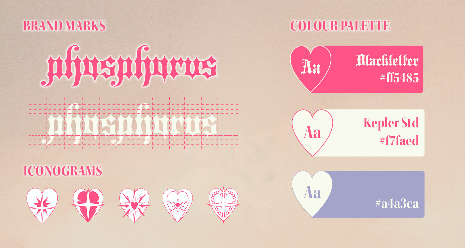
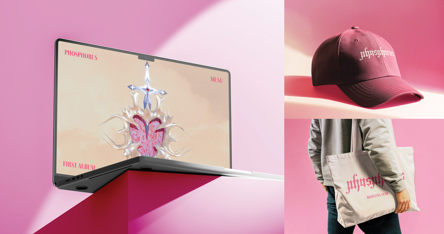
The brand mark is reinterpreted from the traditional Blackletter typeface, a form commonly associated with Gothic-themed design. Through the adaptation of sharp contrasts, elongated strokes, and intricate ornamentation, the typeface is transformed to convey both modern elegance and Gothic expressiveness. This reimagining captures the thematic duality of “Phosphorus”—the interplay between darkness and light, and the journey toward self-acceptance and empowerment (Albertina Museum, 2018).
BRANDING VISUALS:
ALBUM STORY:
“Born of witch heritage, a young girl hides her powers to blend in, ashamed of her difference.
To accept oneself is divine rebellion.
MERCHANDISE:
