Visual Communication - Bachelor
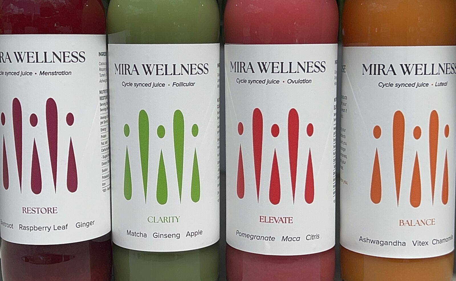
Mira Wellness bridges the gap between self-care and women's health. Created for women, the range of products targets each stage of the menstrual cycle, using researched ingredients to support women mentally and physically. For women who want to take control of their health instead of being controlled by it.
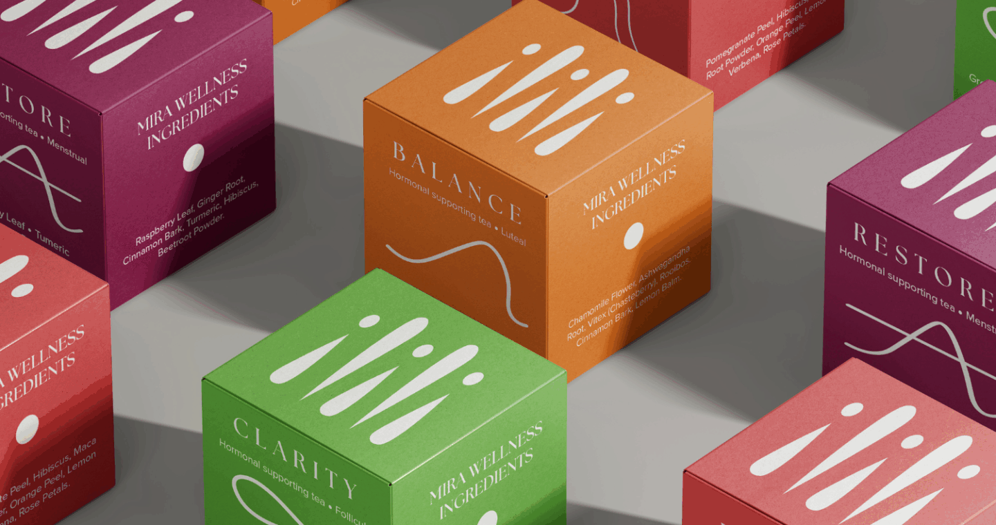

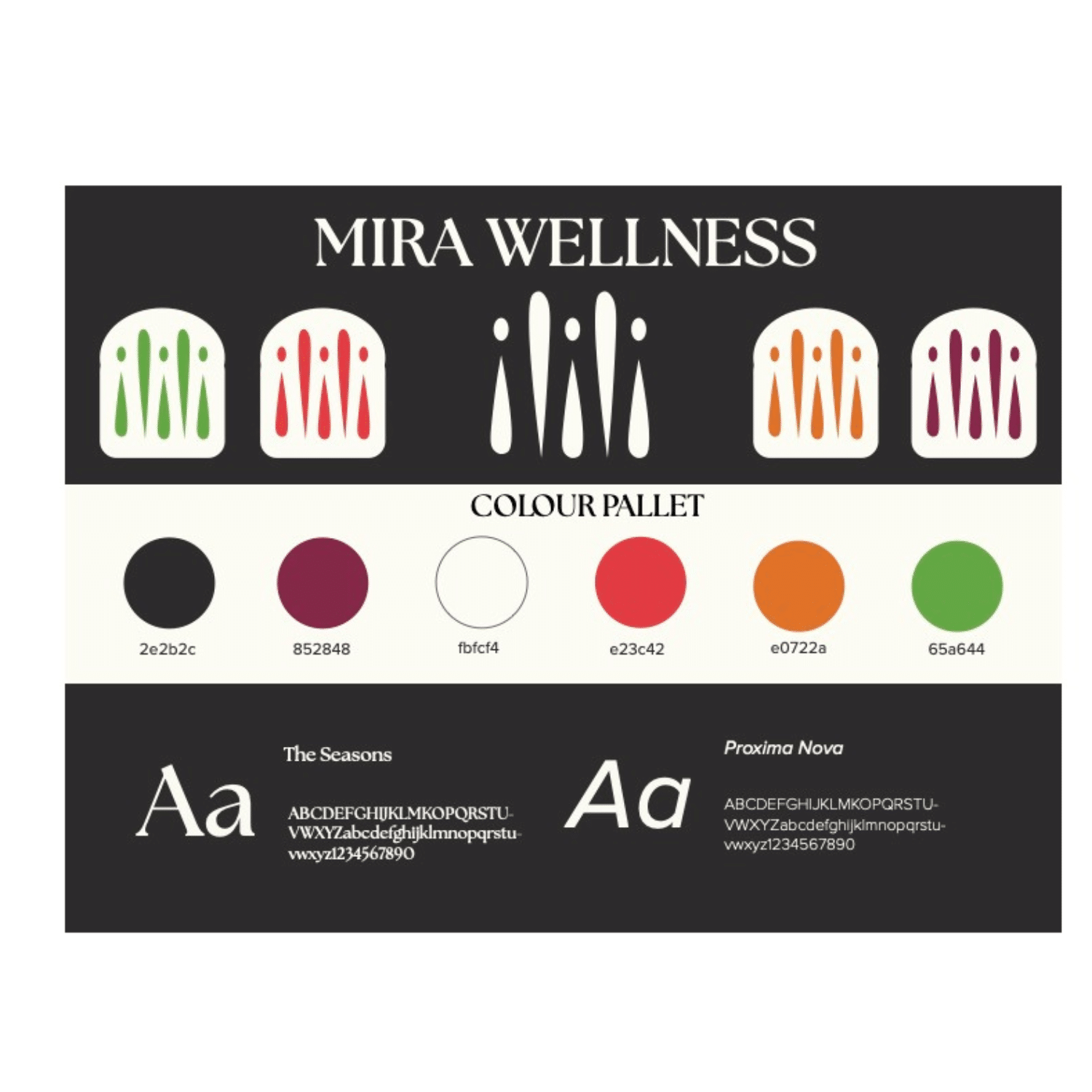
From the logo to the flavour icons, these products are considered more than meets the eye. The logo, based on a woman’s icon, represents the female-centric drink and the different phases of the cycle. The positioning of the elements simultaneously creates an M and a W representing the brand title. These phases are based on the hormonal patterns of the menstrual, follicular, luteal, and ovulatory phases.
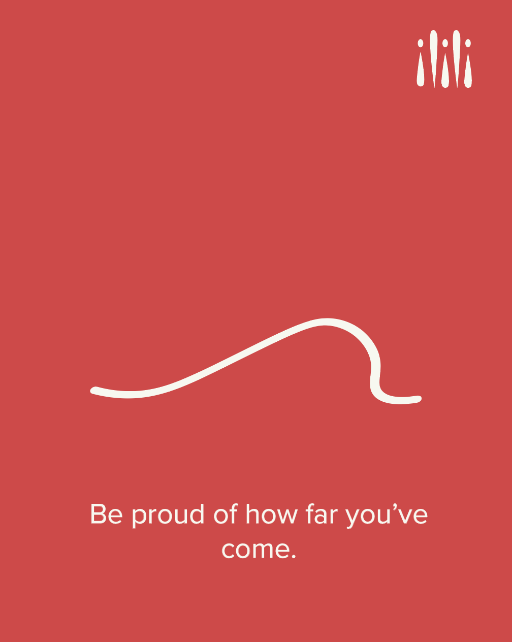
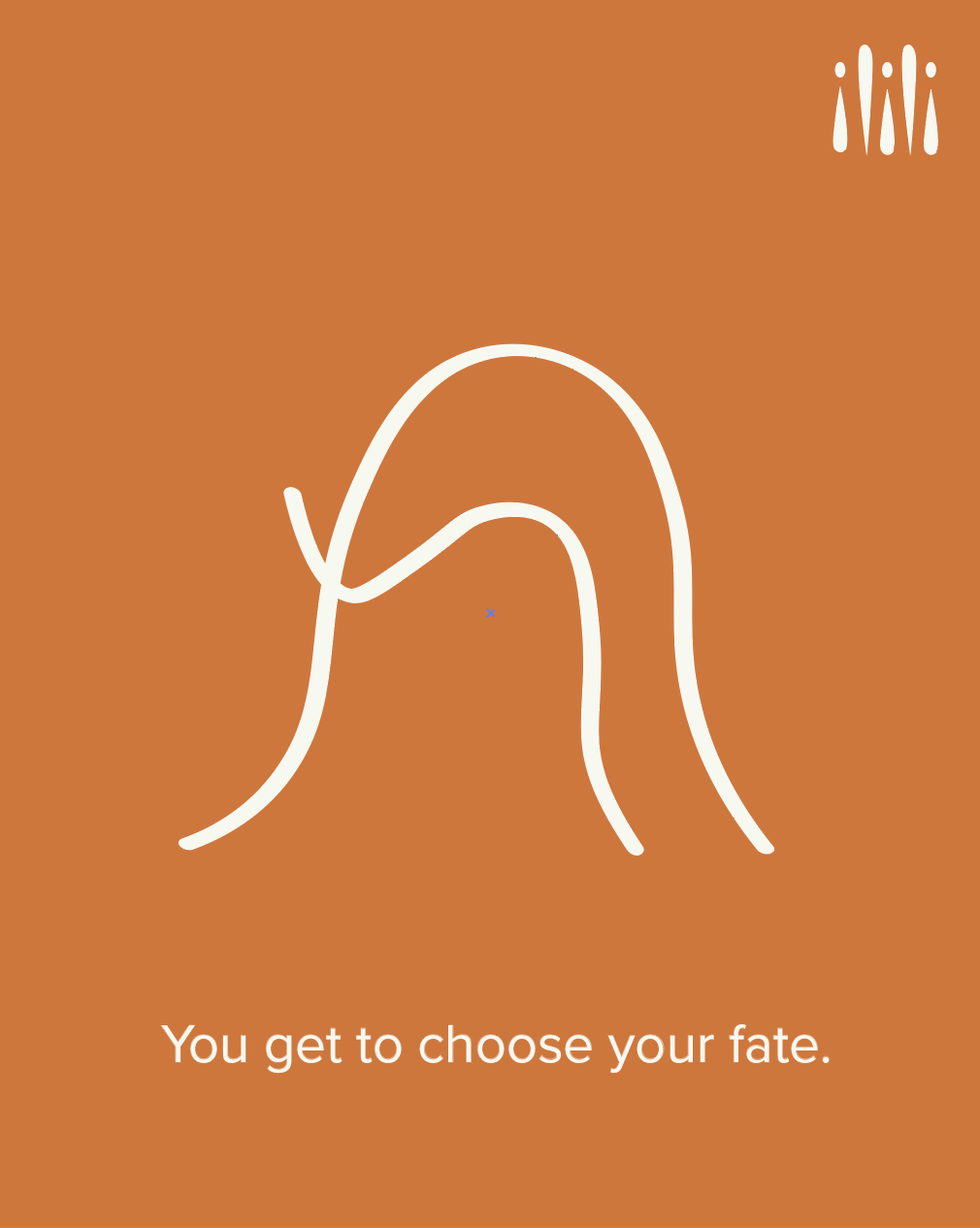
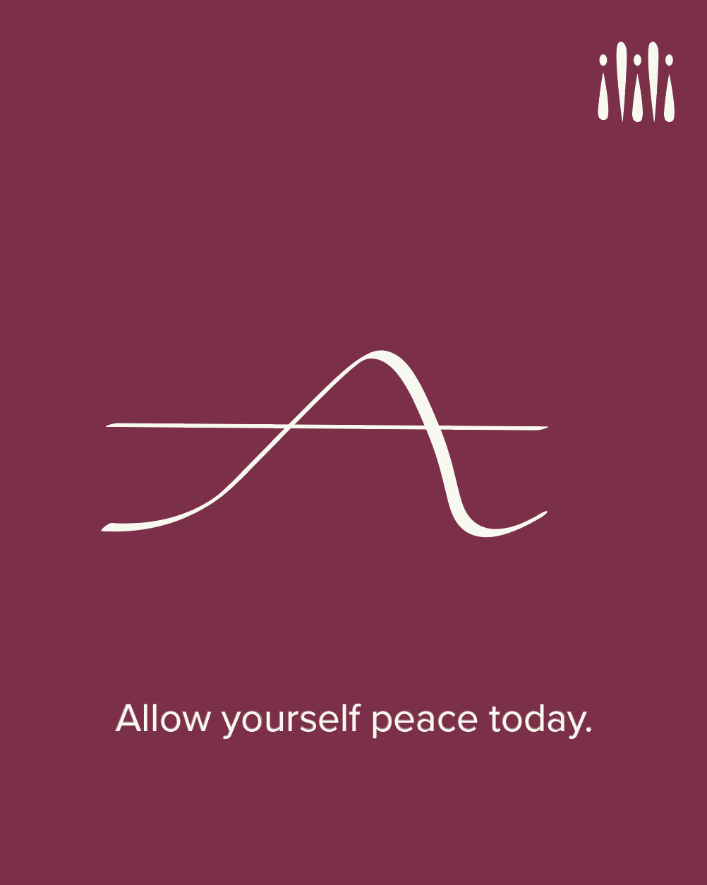
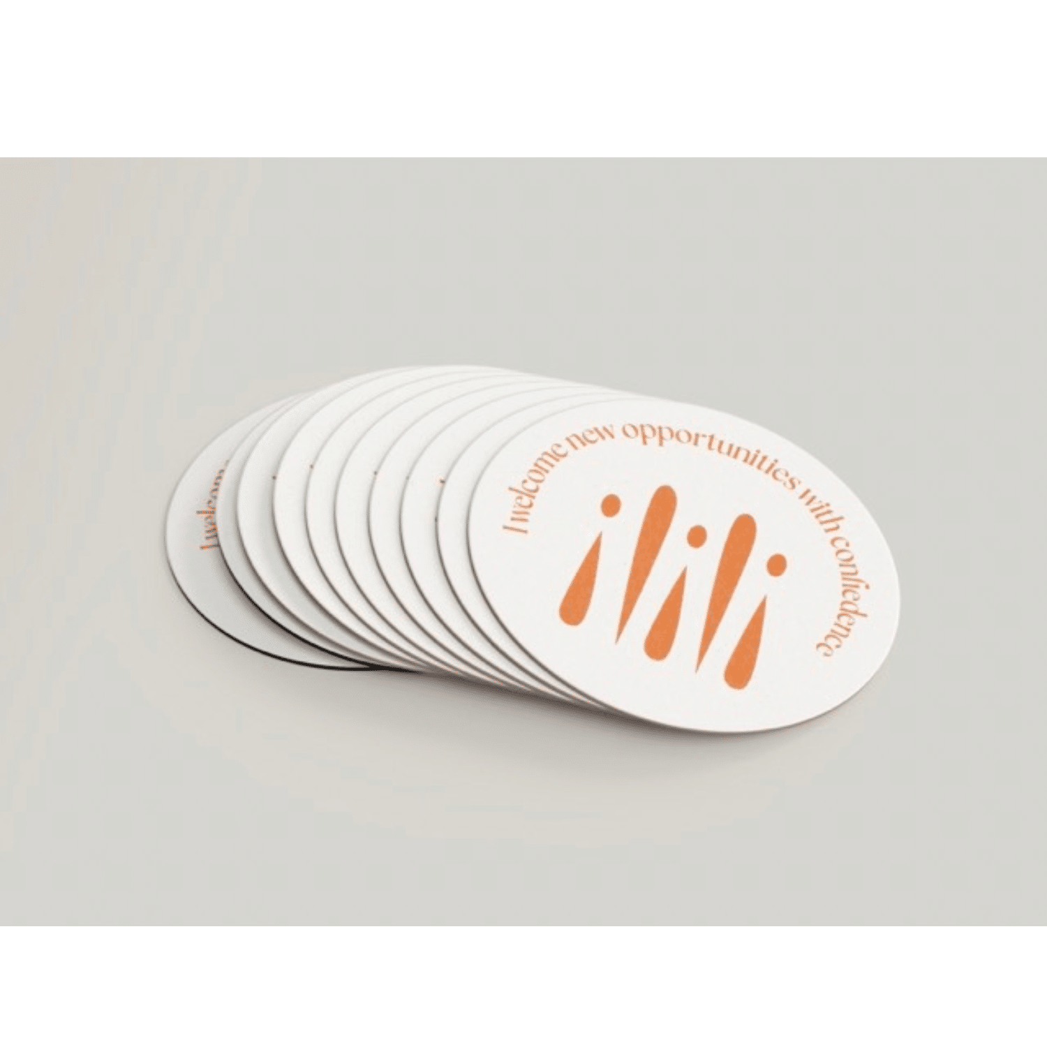
Mira Wellness incorporates affirmations to support women mentally throughout their phases and hormone fluctuations. These primary affirmations are shared through coasters, Instagram posts, and stickers, reminding consumers to be present and kind to themselves.
Sophia is a designer in the communications industry with a background in PR, advertising, and visual communication. This interdisciplinary expertise gives her the ability to connect tangible visuals with emotion and storytelling. Her passions for design, communication, and art are reflected in her original pieces as she continues her journey as a creative professional.