Branding
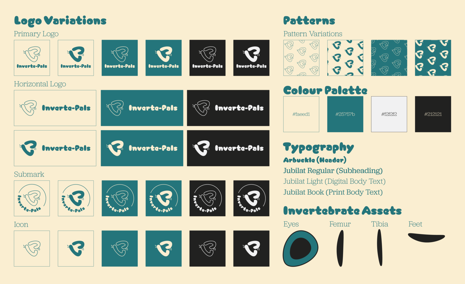
Inverte-Pals’ branding encapsulates the organisation’s playfulness through its fun visual style. The bubbly typography conveys a friendly playfulness; meanwhile, the body text complements the header text while ensuring legibility through its use of serifs. Moreover, the vibrant colour palette further exemplifies the brand’s fun visual style while ensuring memorability through its limited colours.
Inverte-Pals’ logo illustrates a visual metaphor of the brand’s name, depicting two caterpillars forming the letter ‘P’ which can also be interpreted as a heart. Due to their close positioning, it associates them as pals creating the visual metaphor of invertebrates and pals.
Zine
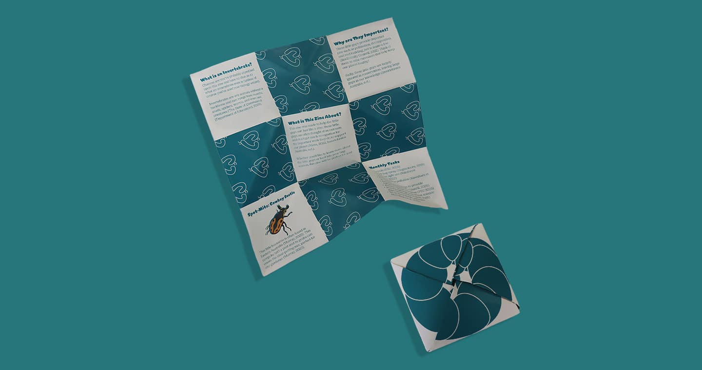
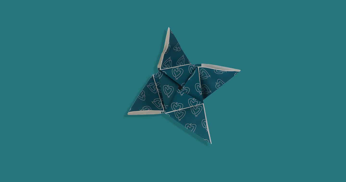
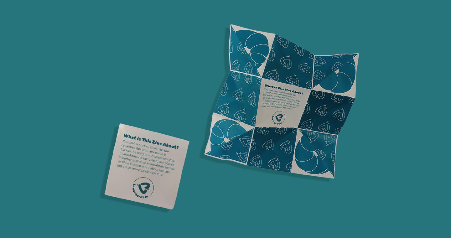
The zine exerts the brand’s playful nature through its tangibility. As readers unfold the zine to discover what’s inside, it engages audiences to further reinforce their learning and ensure brand memorability.
Invertebrate Cards
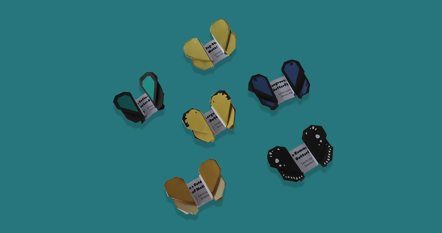
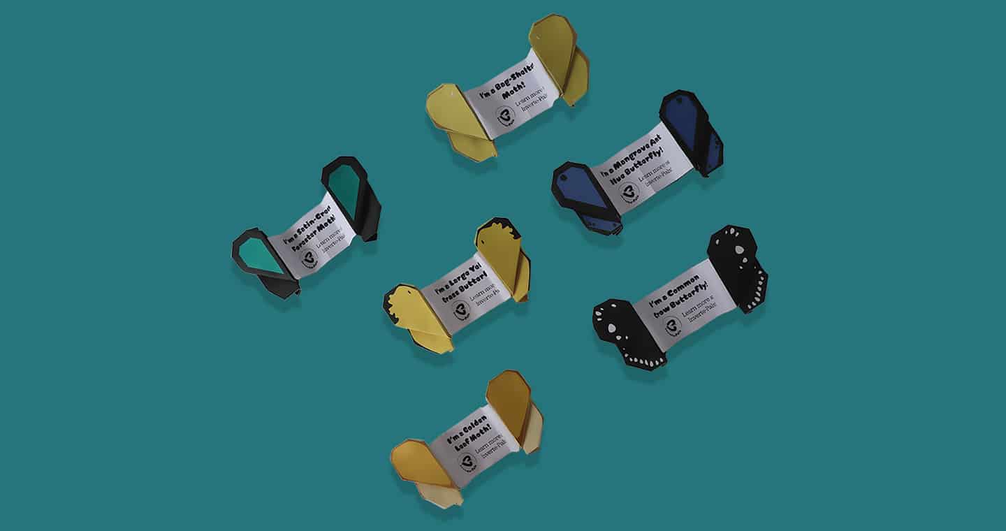
The invertebrate cards provide a tangible and fun design that highlights the brand while educating readers on different invertebrate species. Each card depicts a species of butterfly or moth through the unique wing design. This opens to reveal the species’ name and the Inverte-Pals’ logo to highlight the brand.
Merchandise
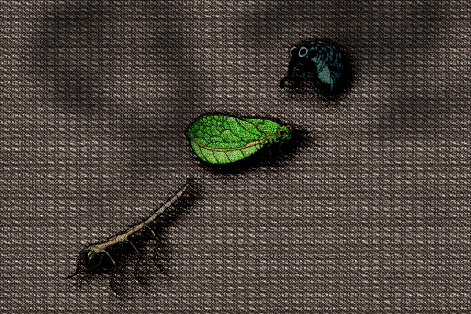
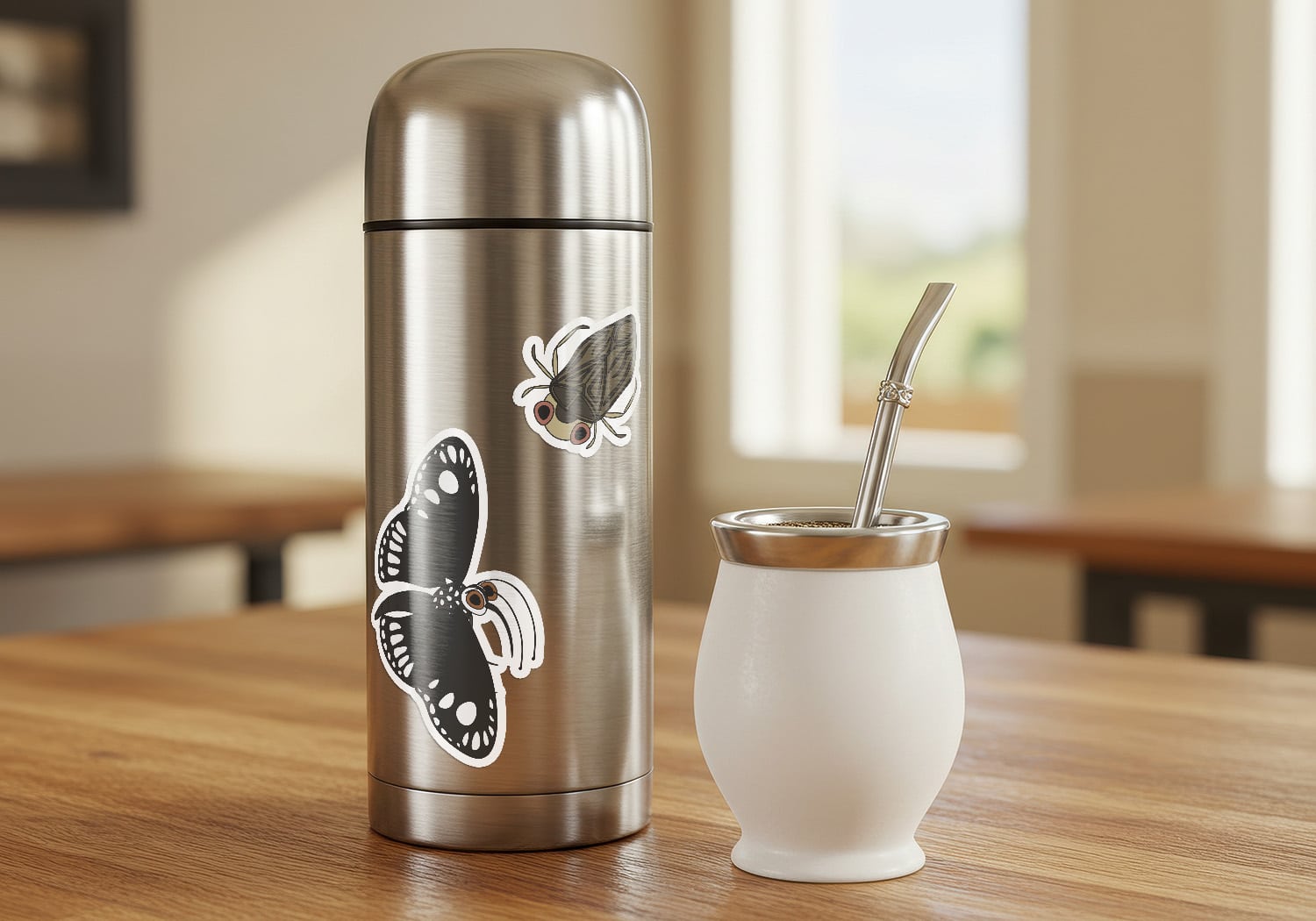
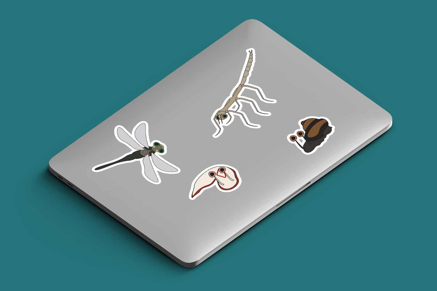
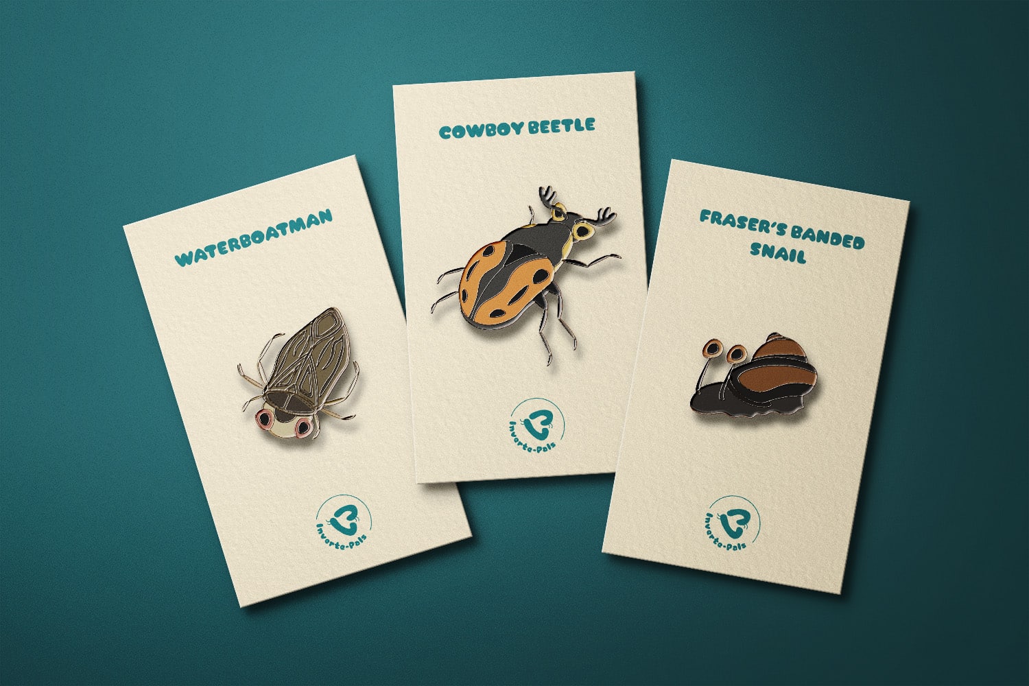
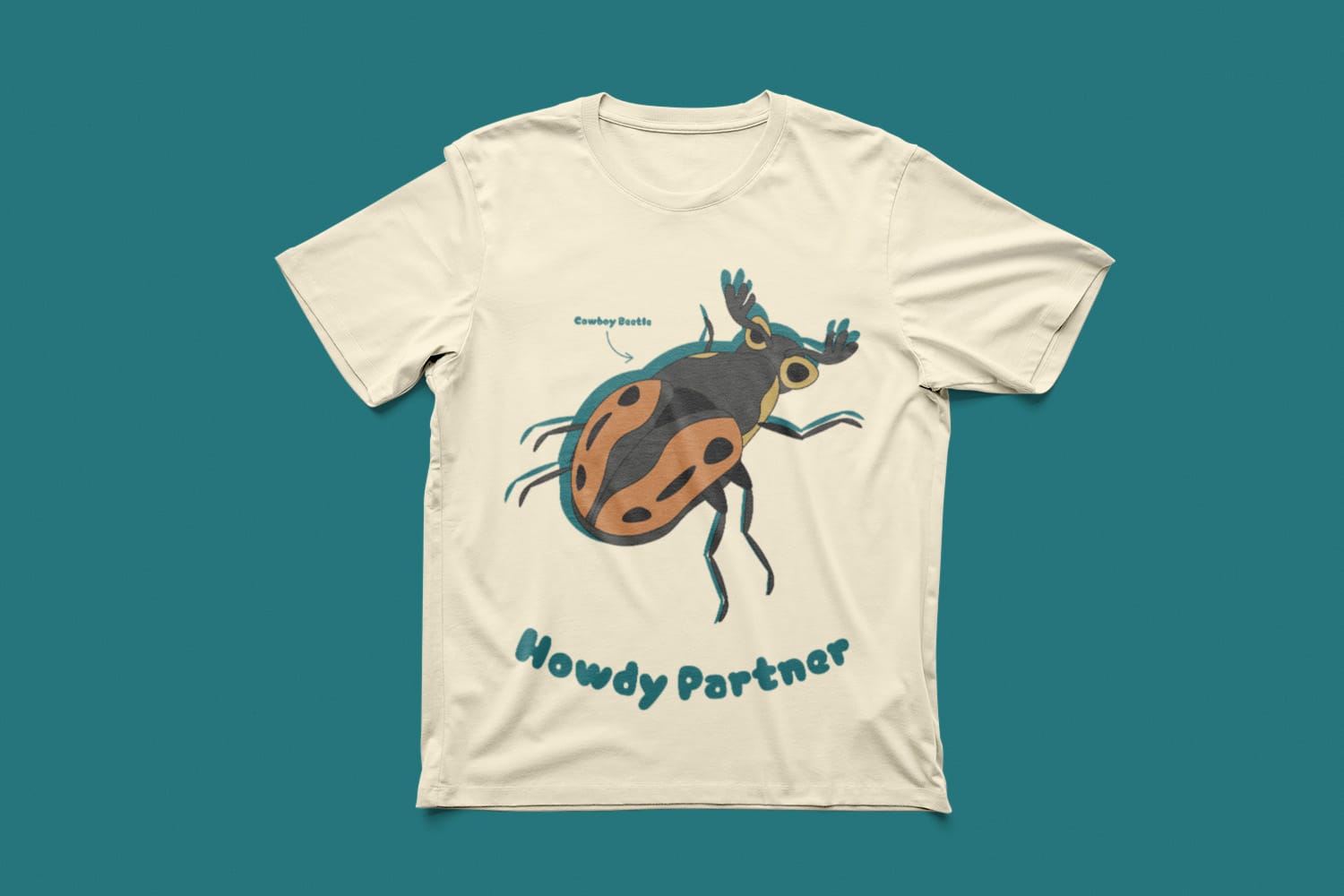
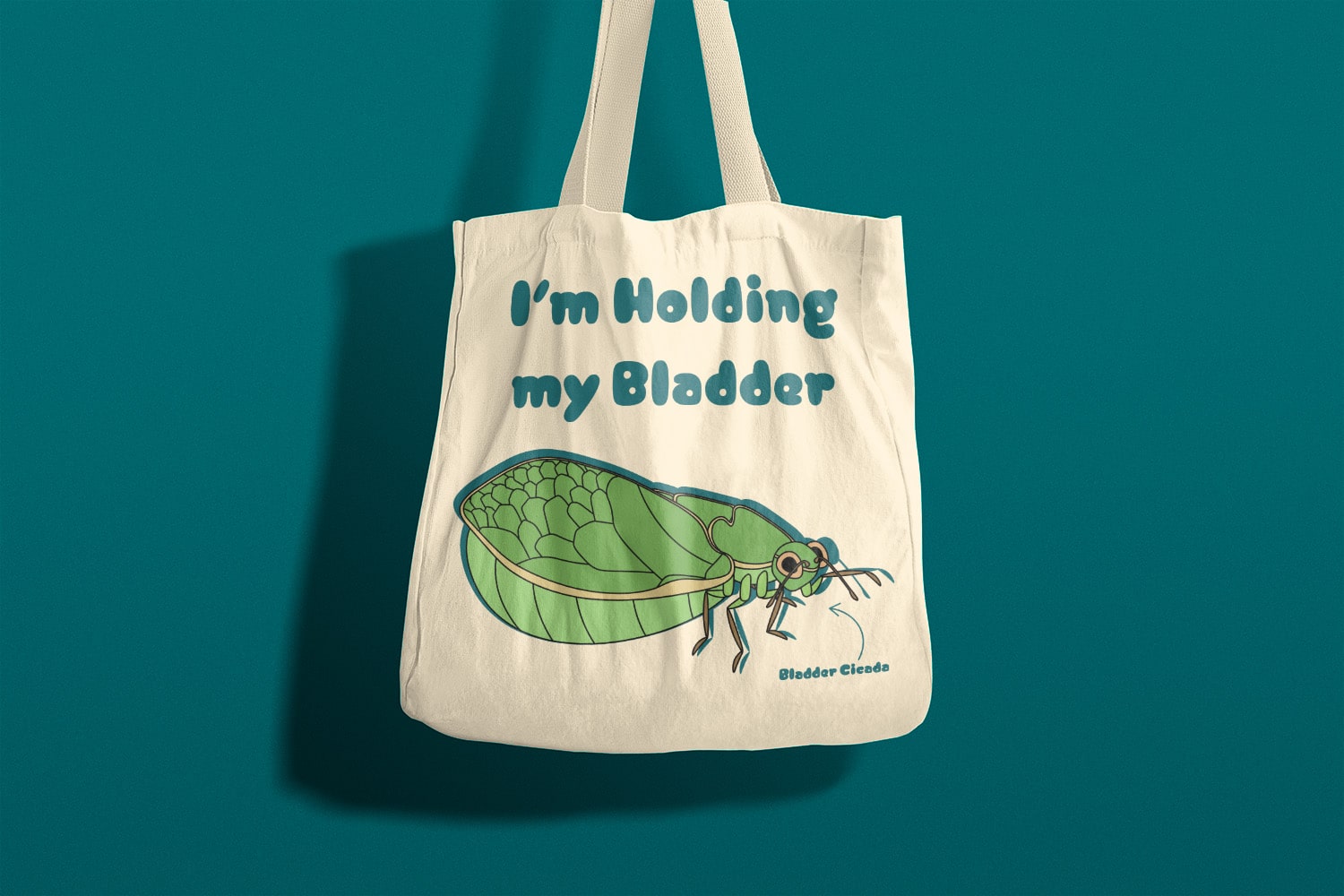
Inverte-Pals’ merchandise further engages audiences and supports the brand’s identity through its fun designs. The sticker, pin, and stick-on patch designs allow audiences to engage with the brand by providing a discrete way for them to show their support for invertebrates. Meanwhile, the shirt and tote bag feature cheeky designs for those enthusiastic about invertebrates and would love to display their passion to others.
Instagram
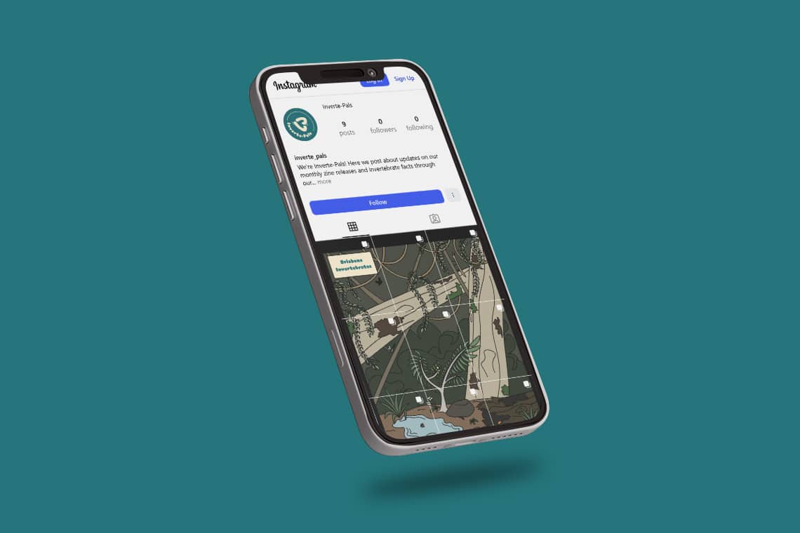
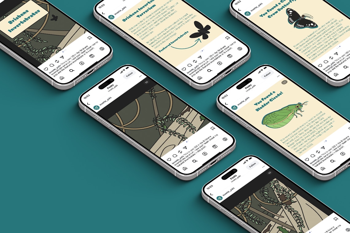
The Instagram page provides audiences with an interactive ‘point and click’ game for viewers to learn about different invertebrates. Each post is connected through a seamless grid which features a terrarium design. When viewers click on a post, they can swipe through the carousel to reveal and learn about the post’s featured invertebrate.
Inverte-Pals’ Instagram
Website
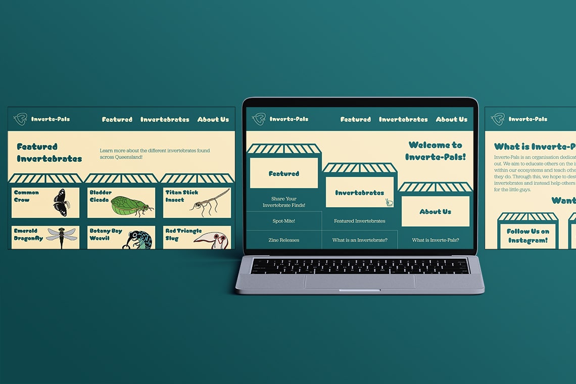
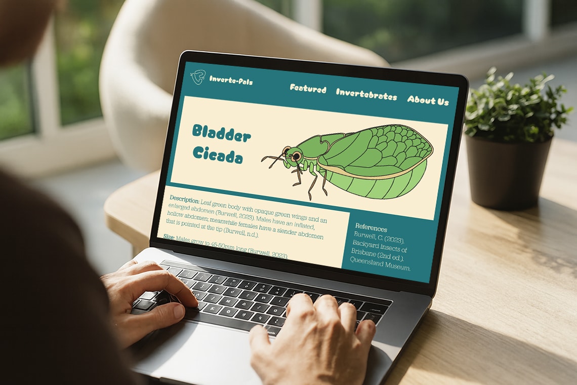
Inverte-Pals’ interactive website is the brand’s main digital touchpoint. The website allows audiences to learn more about the brand and different invertebrates. Each page acts as a ‘terrarium’ users can enter and explore. Audiences can further connect with others through forums on the website to share their passion for invertebrates.
View Inverte-Pals on Behance
Inverte-Pals’ Behance
