Visual Communication - Bachelor
Offbeat:
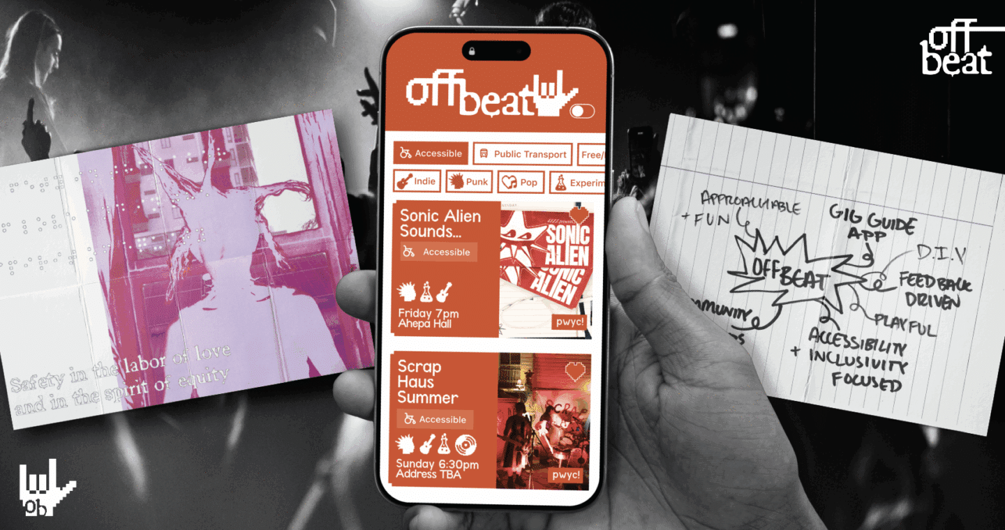
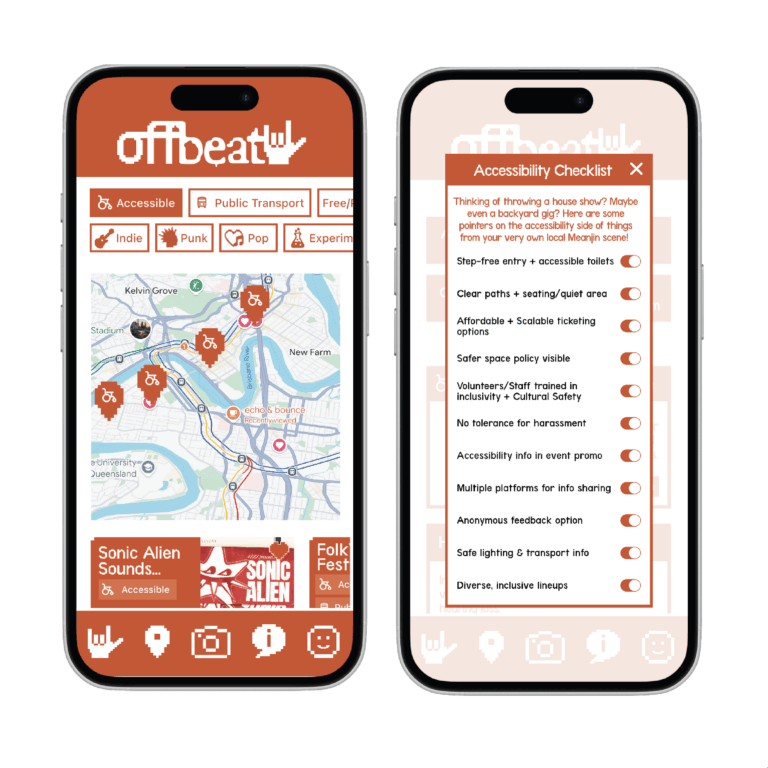
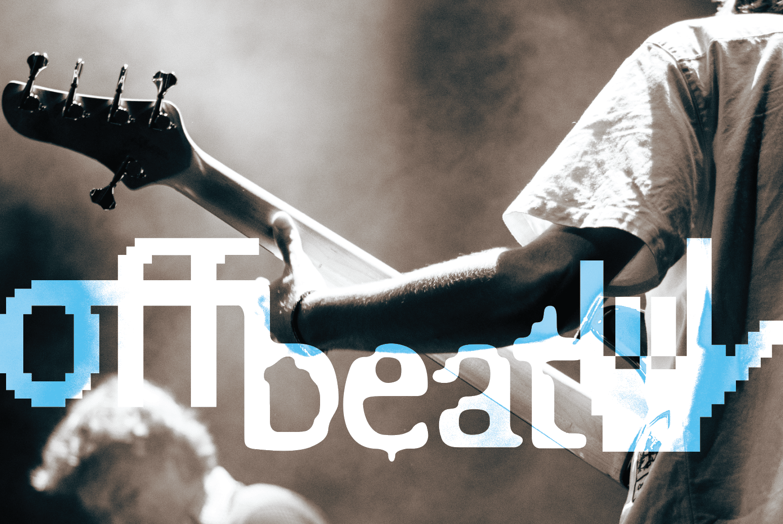
Offbeat is an app-first project designed to connect young people with DIY punk culture in Meanjin/Brisbane, centring accessibility throughout the project.
Visual Communication - Bachelor
Offbeat is an app-first project designed to connect young people with DIY punk culture in Meanjin/Brisbane, centring accessibility throughout the project.

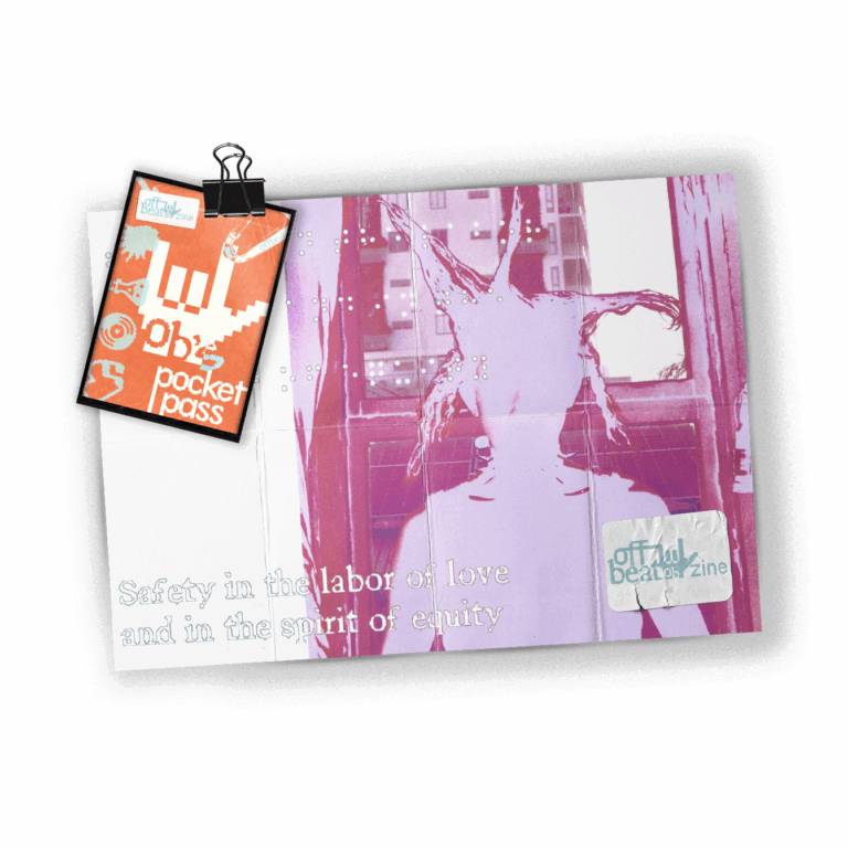
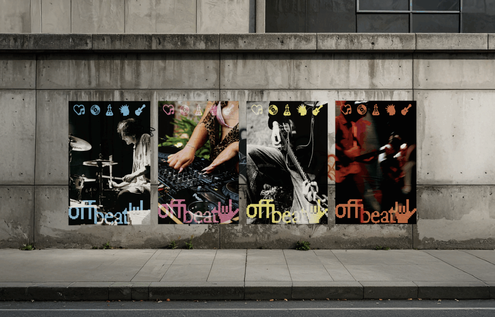
Offbeat’s brand style guide intentionally resists rigid styling rules. Instead, it operates more like a style zine – a set of visual tools that invite remixing, layering, and play. This decision mirrors punk’s DIY ethos, where experimentation and collective authorship are celebrated.
The brand includes bold typography, accessible contrast ratios, and a tight palette to ensure usability. But within those parameters, the icons behave almost like characters: fun, flexible, and capable of shifting across different contexts. They bring levity and warmth into a punk aesthetic, emphasising community and inclusivity.
In this way, Offbeat’s visual identity isn’t “owned” by a single designer. It’s deliberately loose so that future collaborators, organisers, and users can reinterpret the brand while keeping its spirit intact.
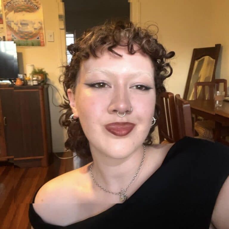
Emily Lecole is a Meanjin-based Visual Communicator who specialises in print media, human-centred design and photography. Passionate about local community initiatives, Emily has collaborated with the Greens, 4ZZZ, and creative-directed publications such as Frocket Zine and Rosario Journal. They intend to pursue a role in the music or fashion branding industry while continuing to lend their skills to local organisers.