Project Statement
The project is driven by the importance of authenticity, individuality, and audience engagement within the indie scene. Fans aged 16–30 value visual storytelling that extends beyond sound through vinyl artwork, posters, merchandise, and online content. By creating a unified identity for Cat Splat and its upcoming album Static Bloom, this project aims to show how thoughtful design can amplify connection, reflect artistic personality, and position an imagined band as a credible and distinctive presence.
The project draws on the indie rock tradition of authenticity, individuality, and experimentation,values often expressed through raw, handmade aesthetics in album art, posters, and merchandise. Building on these foundations, this work integrates contemporary design trends such as AI-powered visual generation and handcrafted illustration (Adobe, 2025), merging analogue imperfection with digital precision.
The creative direction combines hand-drawn typography, collage, and textured surfaces with selective digital layering using software such as Adobe Illustrator, Photoshop, Framer, Adobe Firefly and ElevenLabs.
Style Guide
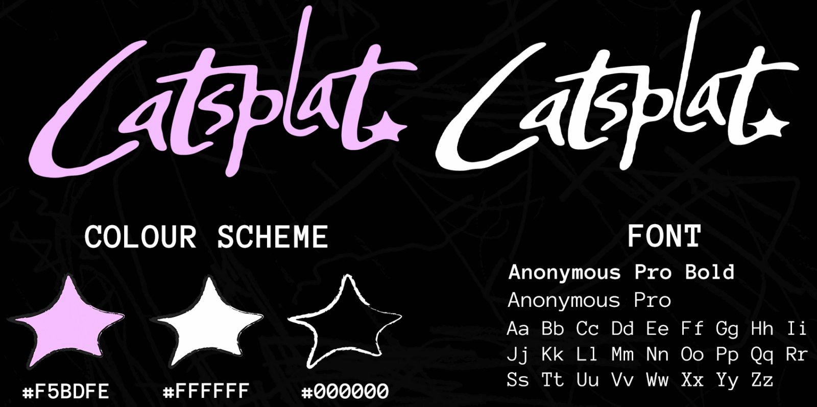
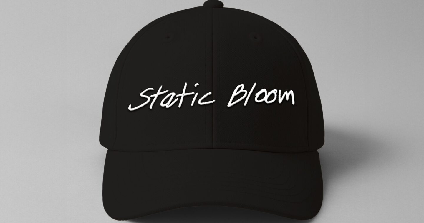
The Cat Splat logo was made with Adobe Illustrator and uses expressive, hand-drawn typography to capture the band’s raw and unfiltered energy. The irregular line weight and imperfect letterforms reflect the band’s DIY aesthetic and connection to underground indie culture. Through strong use of contrast, rhythm, and balance, the logo feels both spontaneous and deliberate, mirroring the emotional intensity and creative freedom in their music. The minimal handwritten style allows it to remain adaptable across merchandise, album art, and digital media while reinforcing the band’s authentic and personalised visual identity.
ALBUM AND VINYL DESIGN
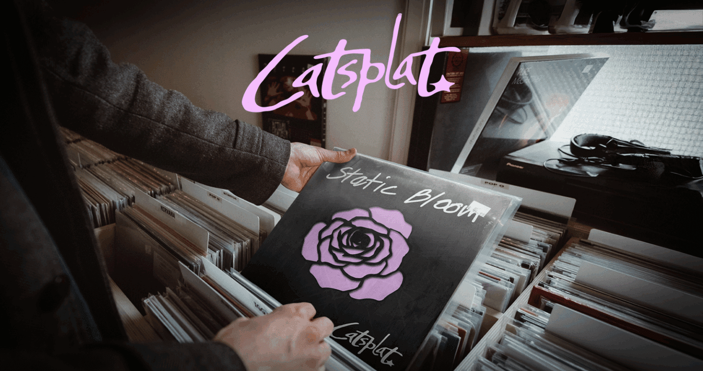
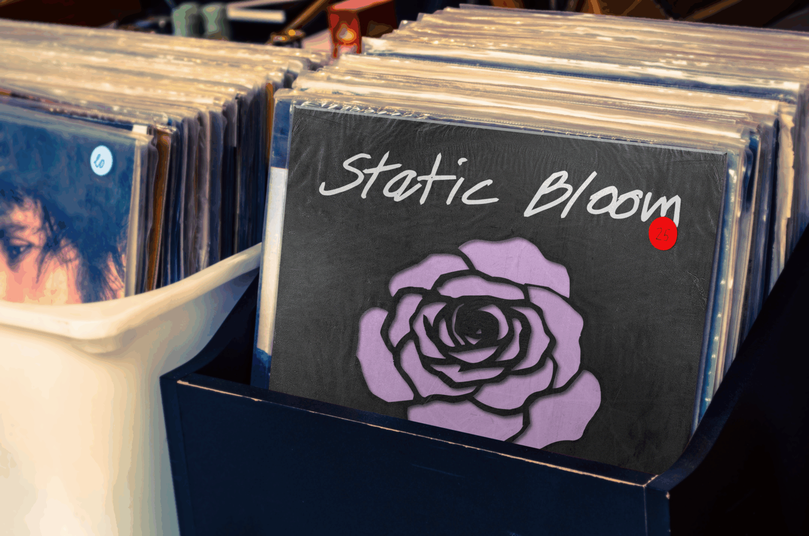
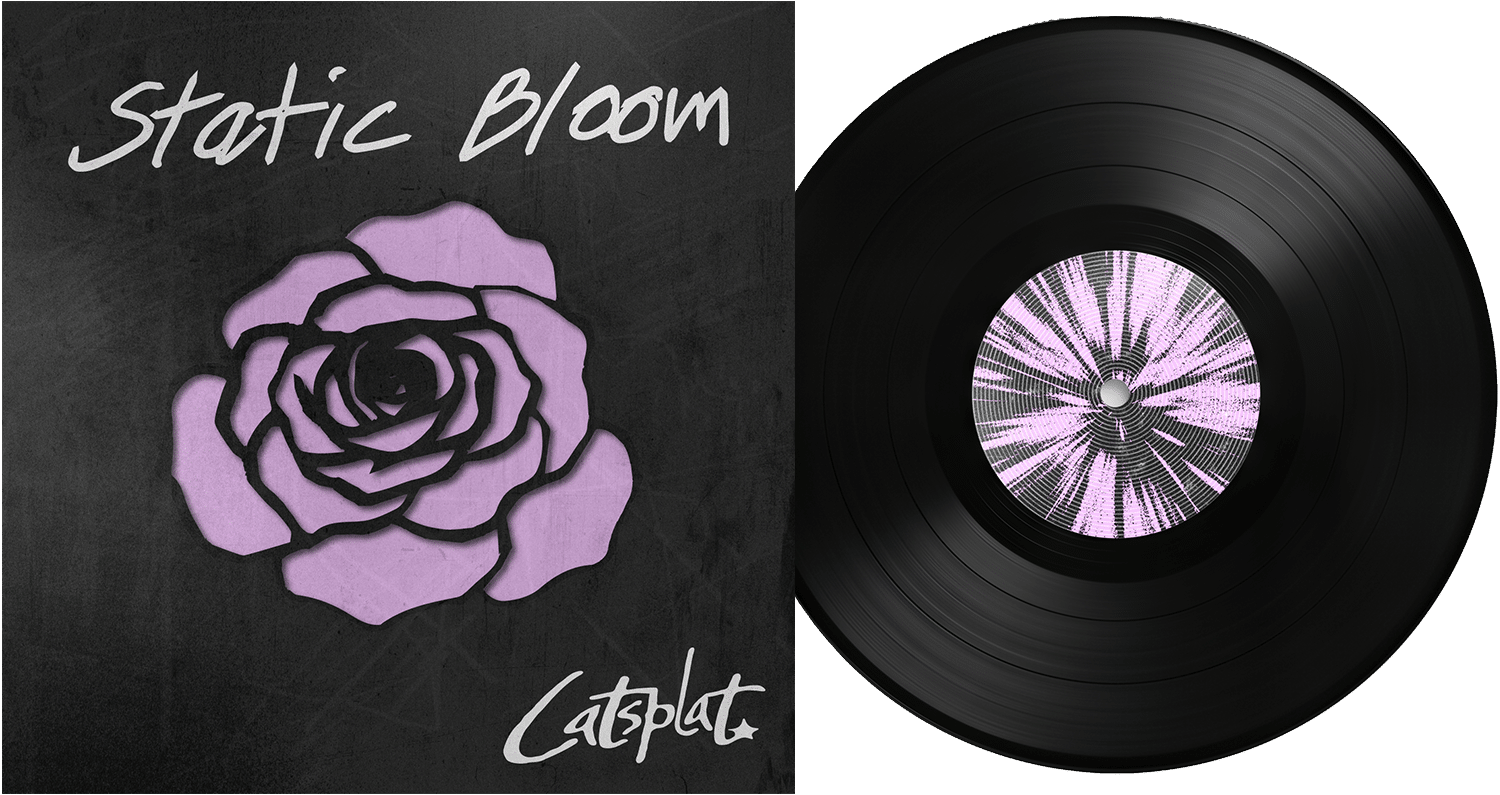
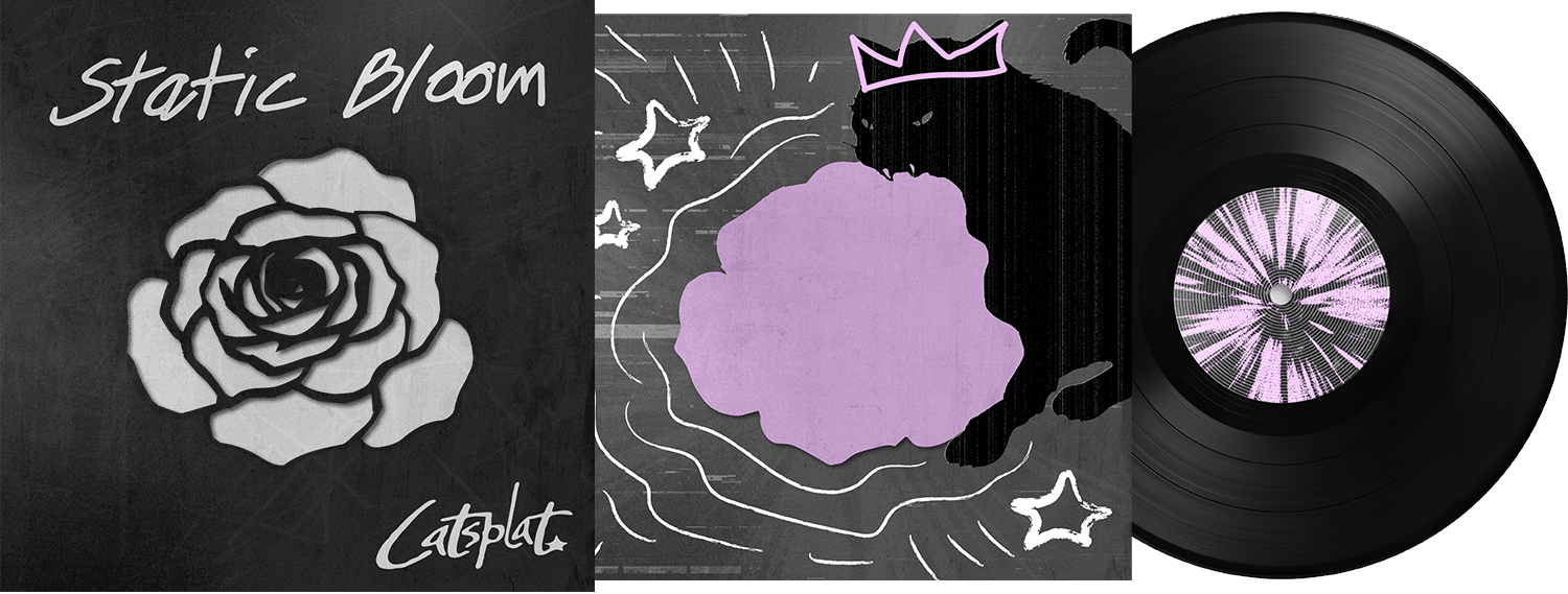
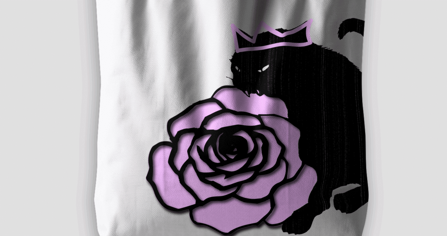
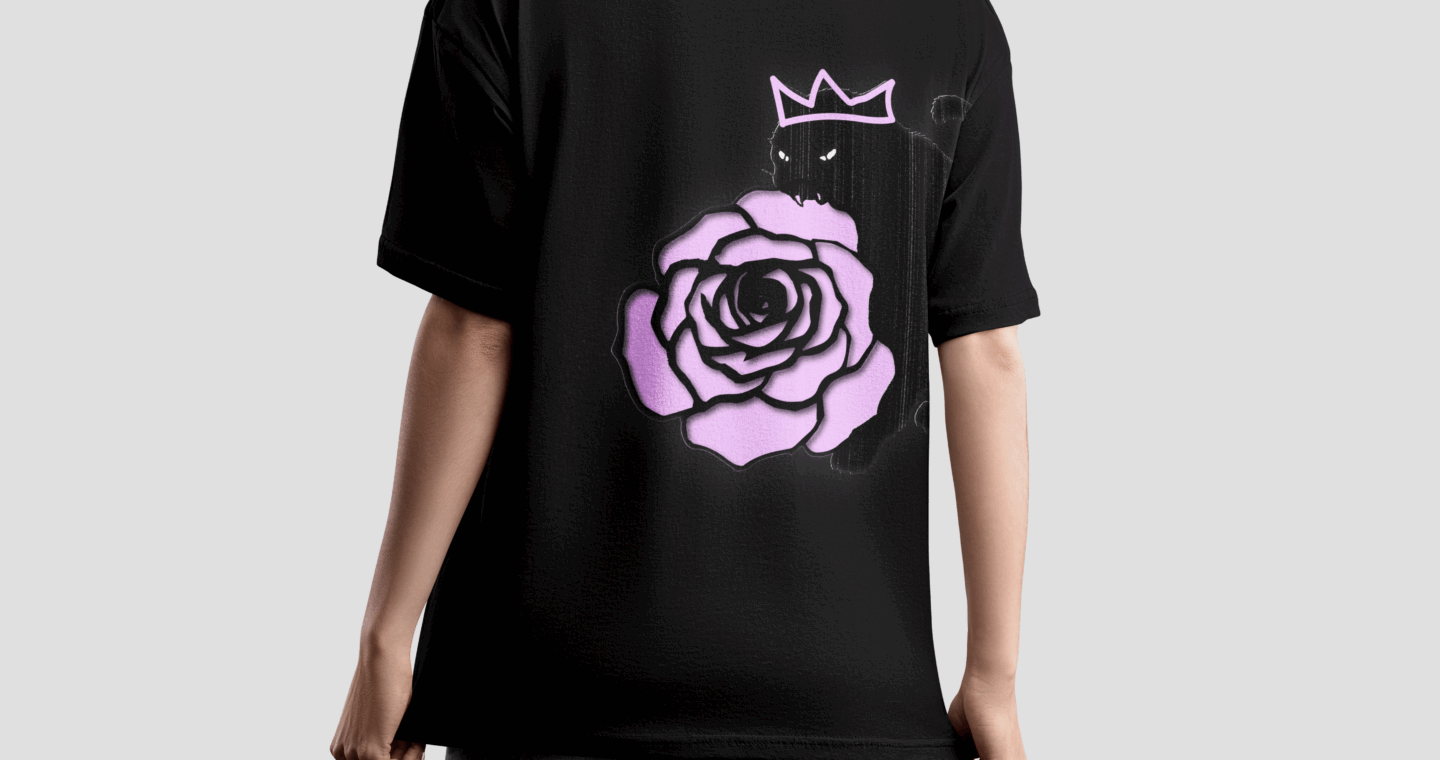
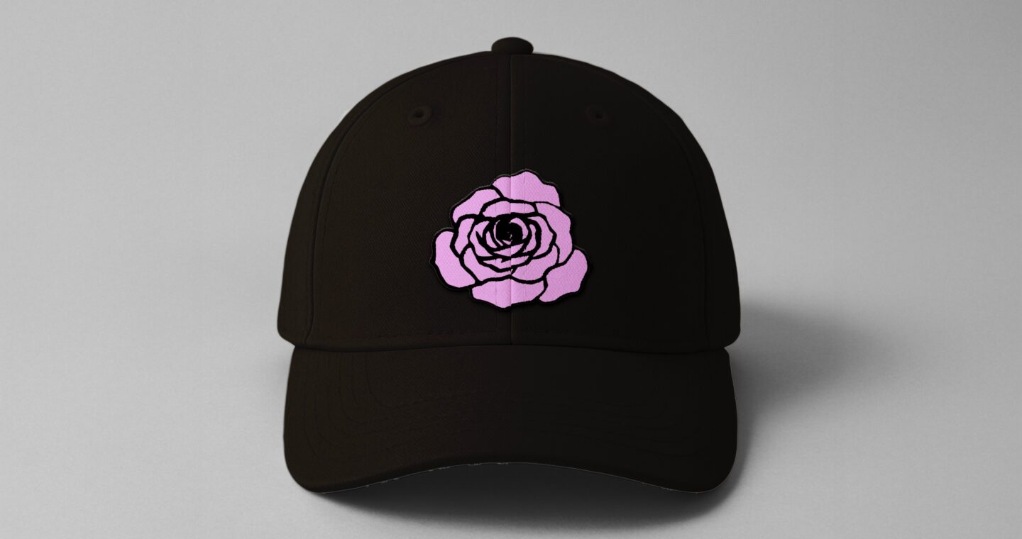
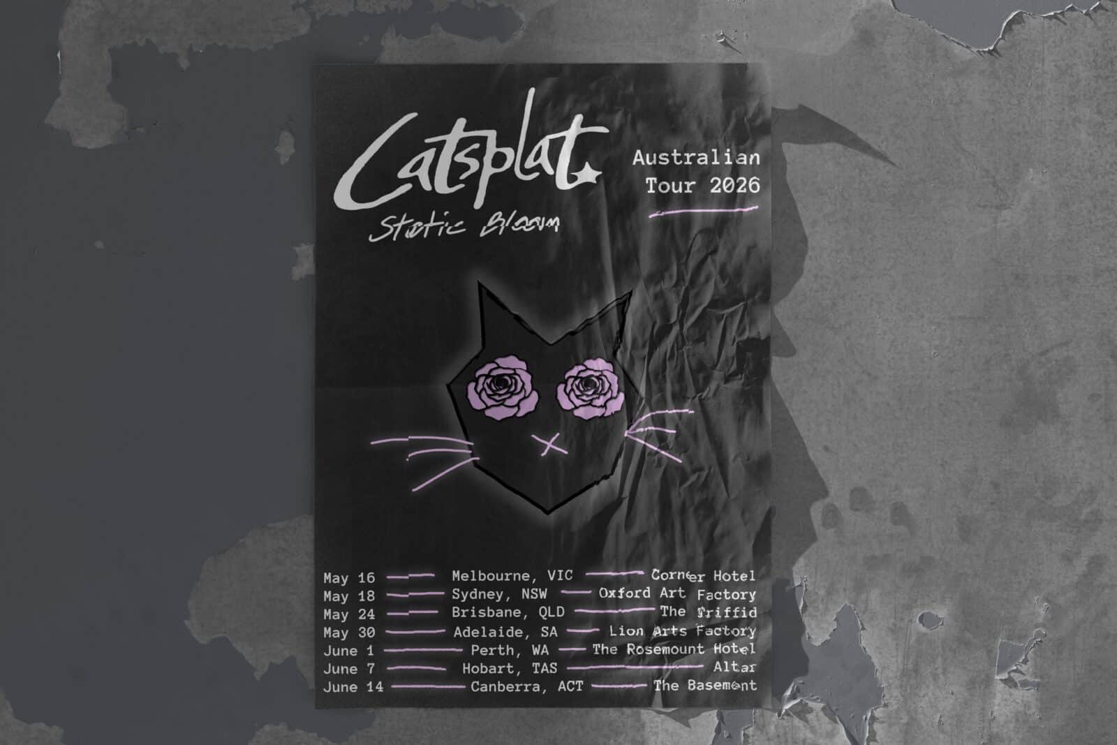
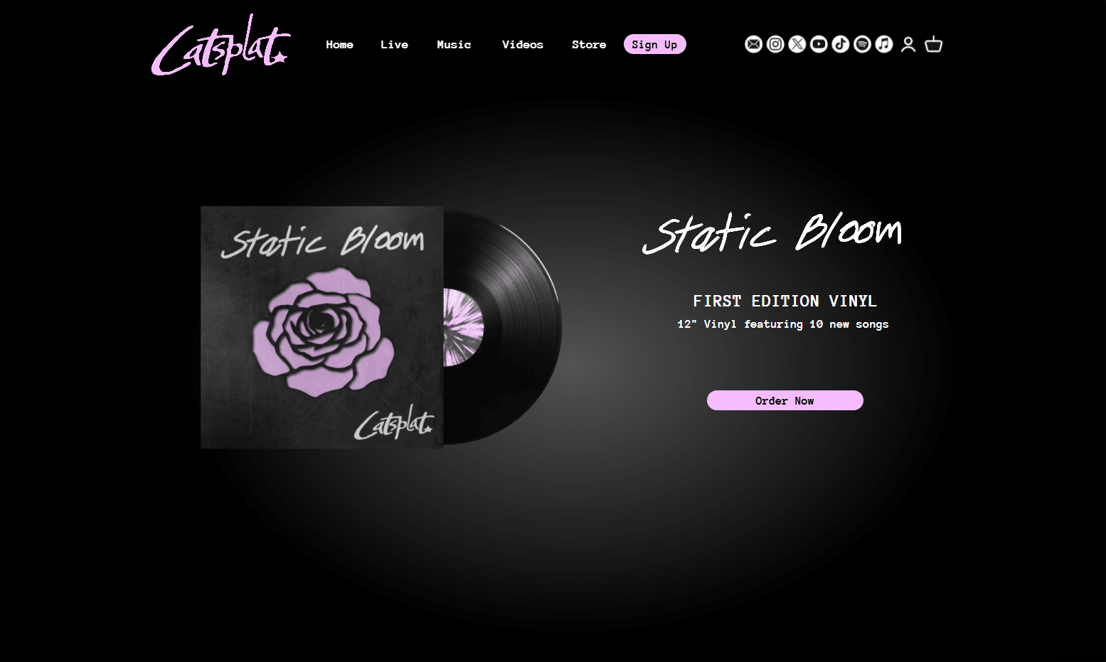
The Static Bloom album design evolved from the concept of contrast, pairing fragility and distortion to reflect the band’s raw yet emotional sound. The central motif, a cut-out rose illustration, symbolises the beauty found in imperfection and ties directly to the album title. The artwork builds on the hand-drawn aesthetic established in the logo, using Adobe Photoshop to create layers of scanned textures and photographed surfaces to add tactile depth and cohesion.
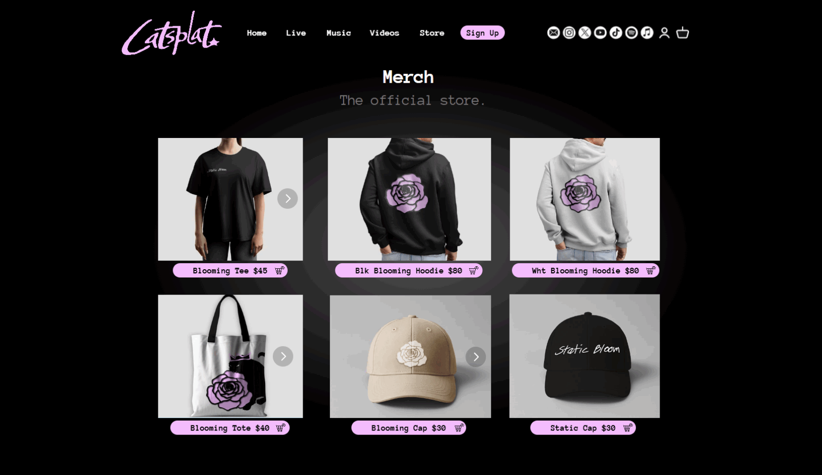
MERCH DESIGN
Tour poster
Lyric video
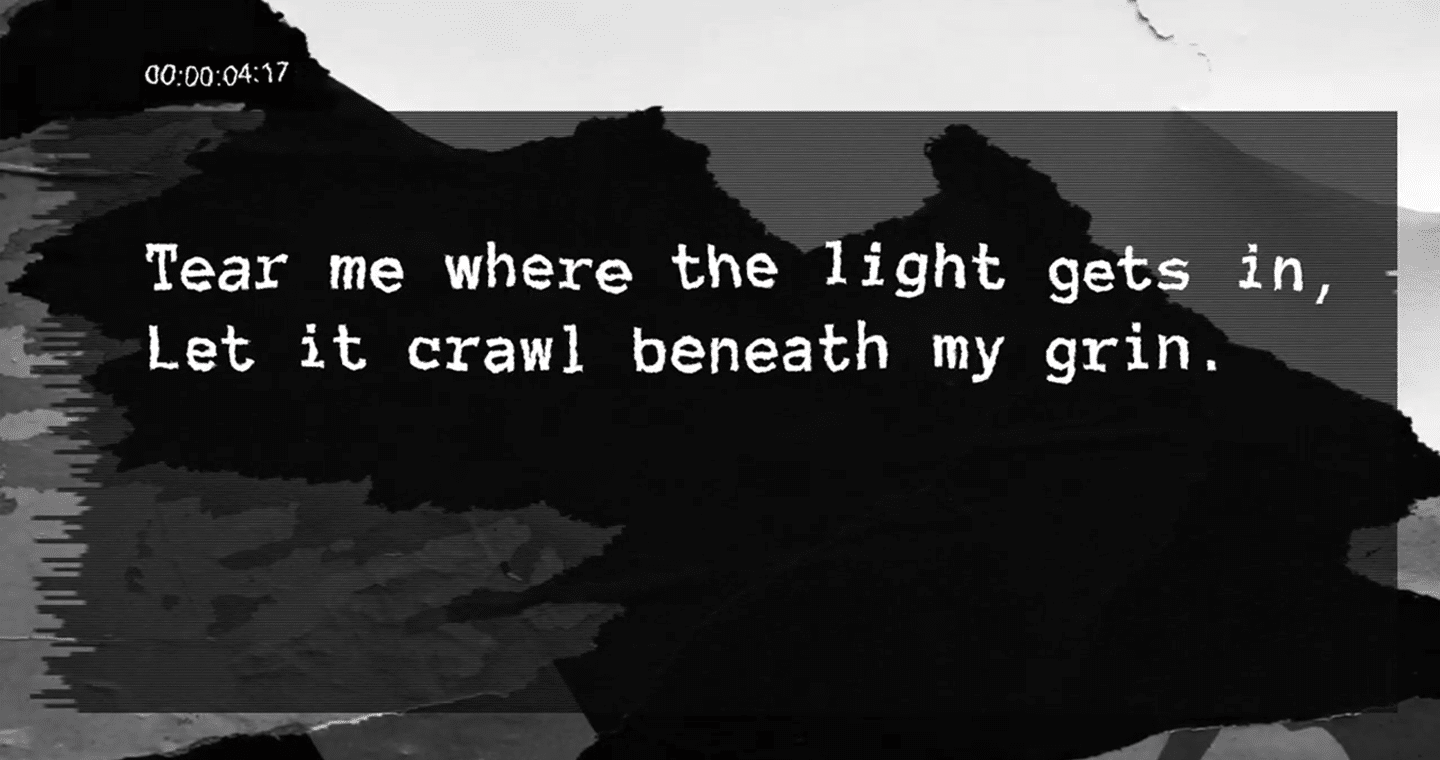
The audio from this lyric video was made using an AI Voice Generator (ElevenLabs) where description of lyrics and mood of the song were used as the prompt.
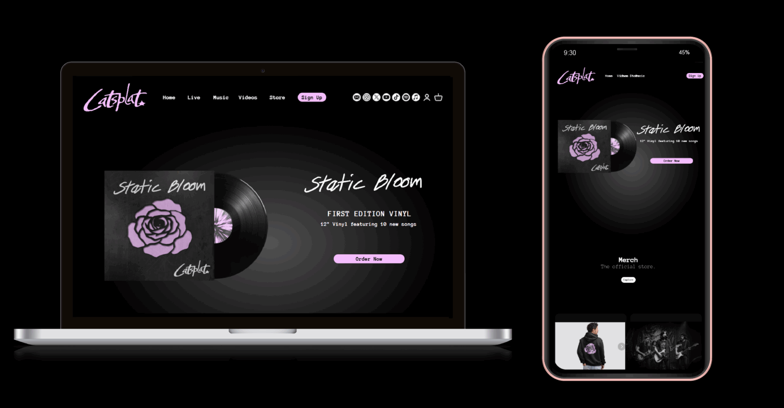
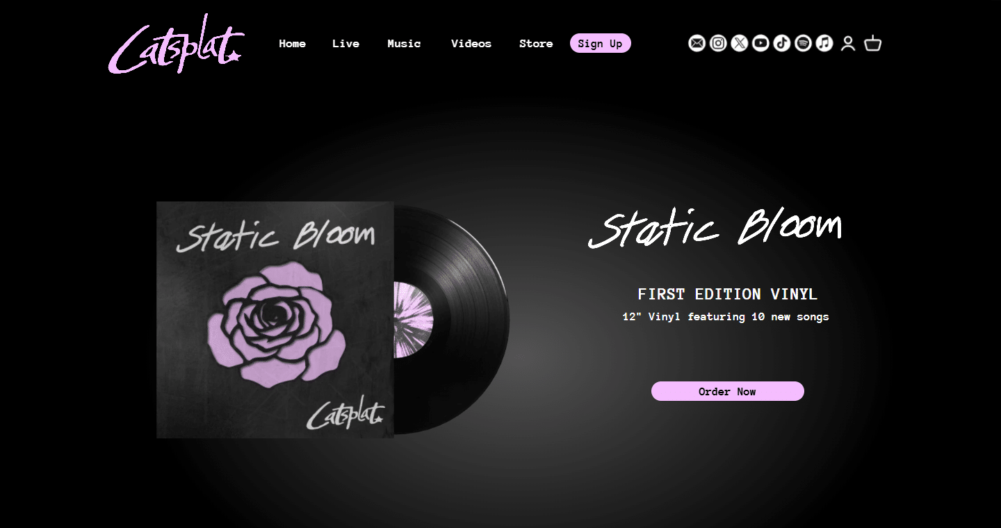
Website design
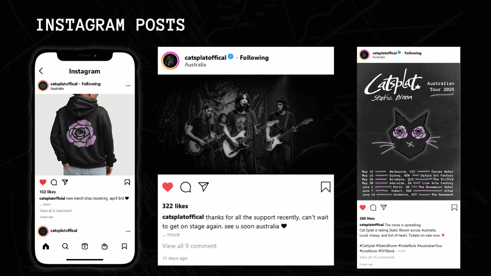
Instagram posts
PROJECT BEHANCE
