Brand style guide
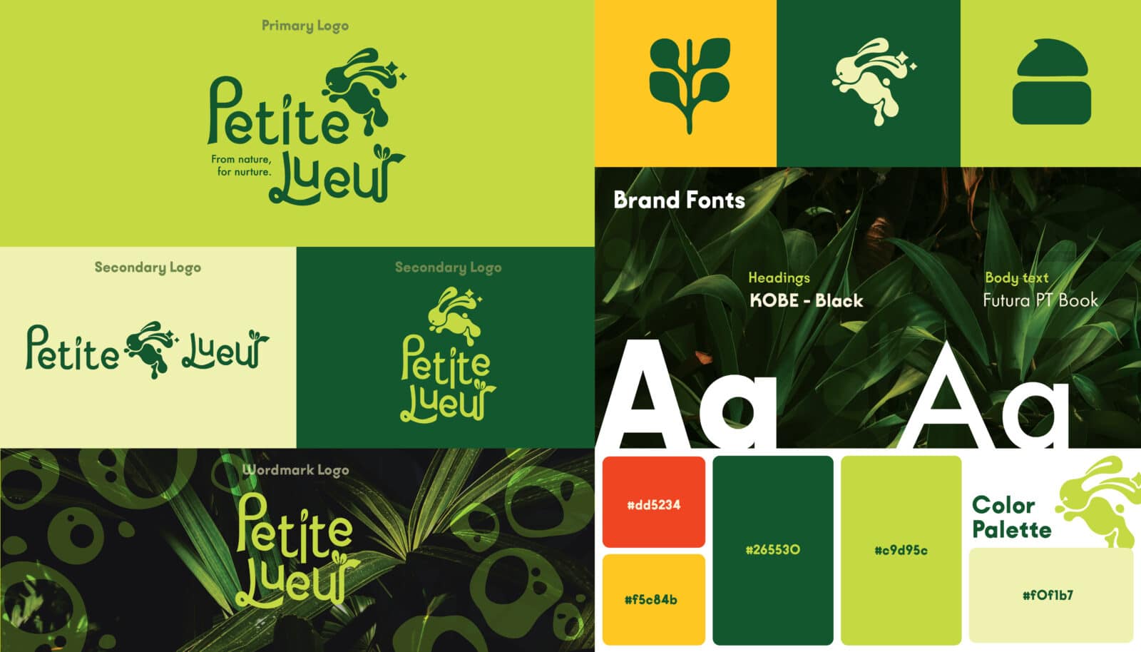
The style guide establishes a friendly and inclusive visual identity, combining shapes and soft tones to express the brand’s natural values. The color palette features gentle, neutral greens and yellows, intentionally chosen to avoid gender bias and promote skincare for everyone. The logo introduces a playful bunny mascot that symbolizes care, purity, and natural energy, while the small sparkles surrounding it represent a gentle, radiant glow, reflecting the brand’s promise of nurturing skin health and confidence.
Brand mascots
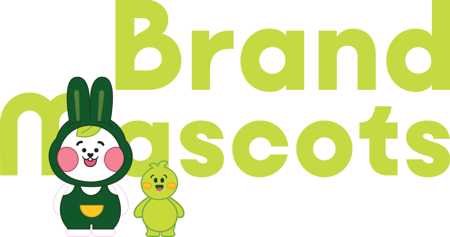
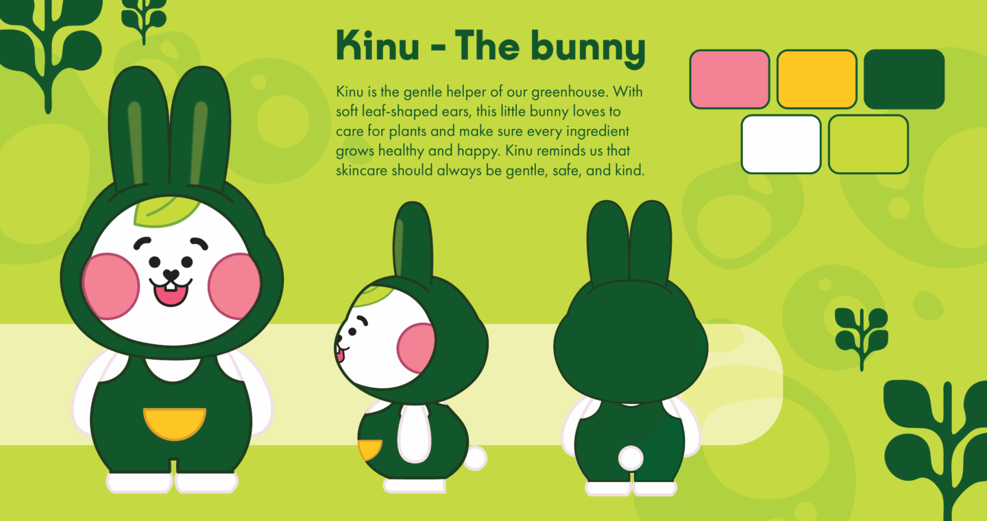
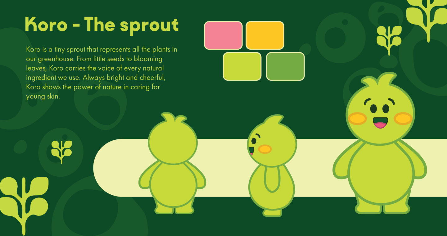
Petite Lueur introduces two mascots: Kinu, a gentle bunny, and Koro, a lively little sprout. Together, they guide children through each product experience, turning skincare routines into moments of play, learning, and connection with nature.
brand assets
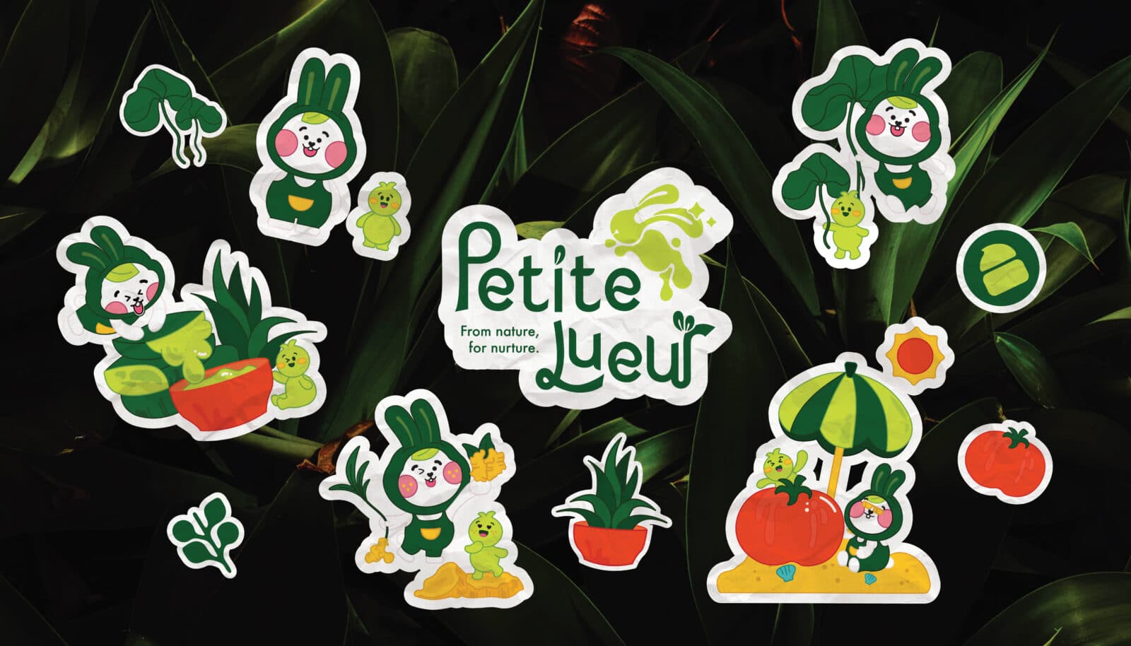
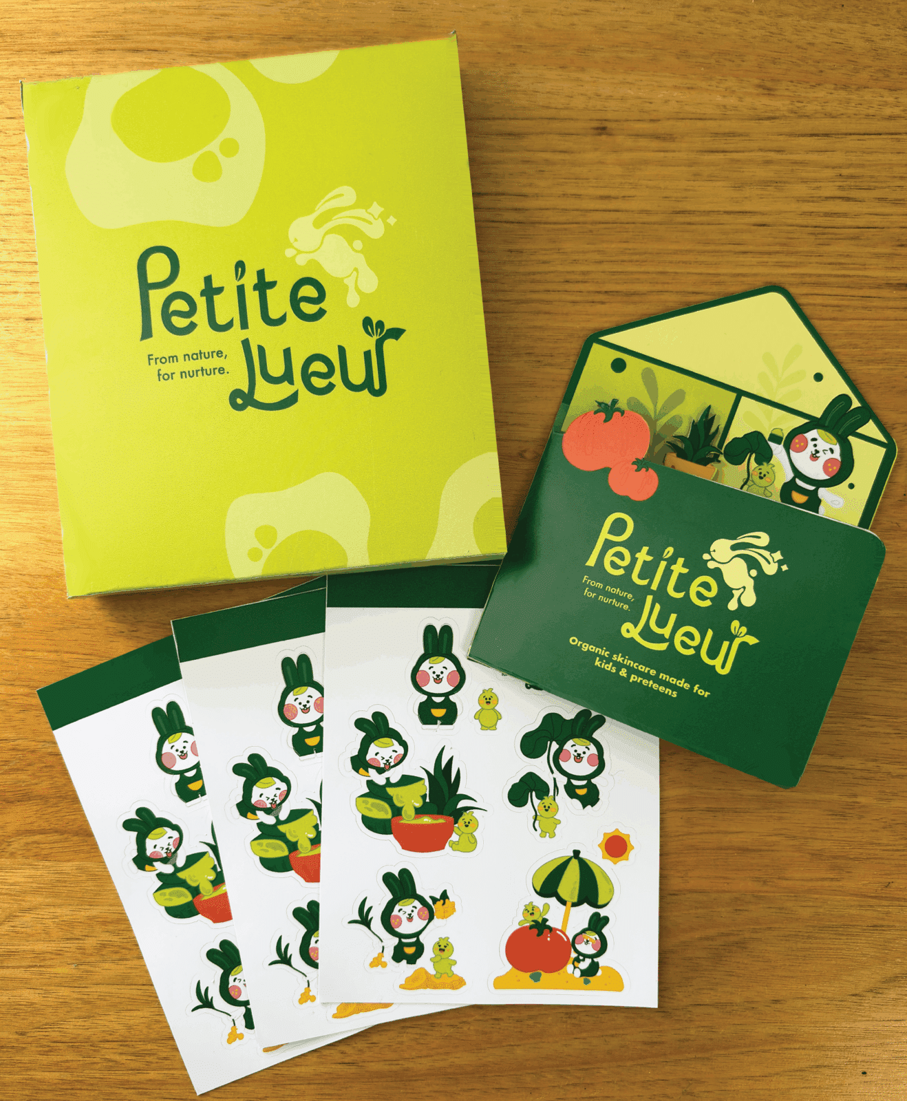
The mascots have been utilized to develop a range of brand assets, appearing as playful illustrations across physical packaging, social media, and website materials to create a consistent and engaging brand presence.
Product packaging
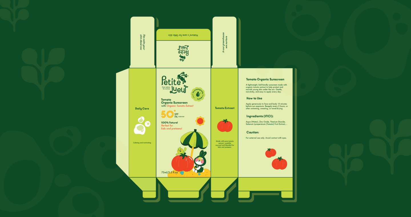
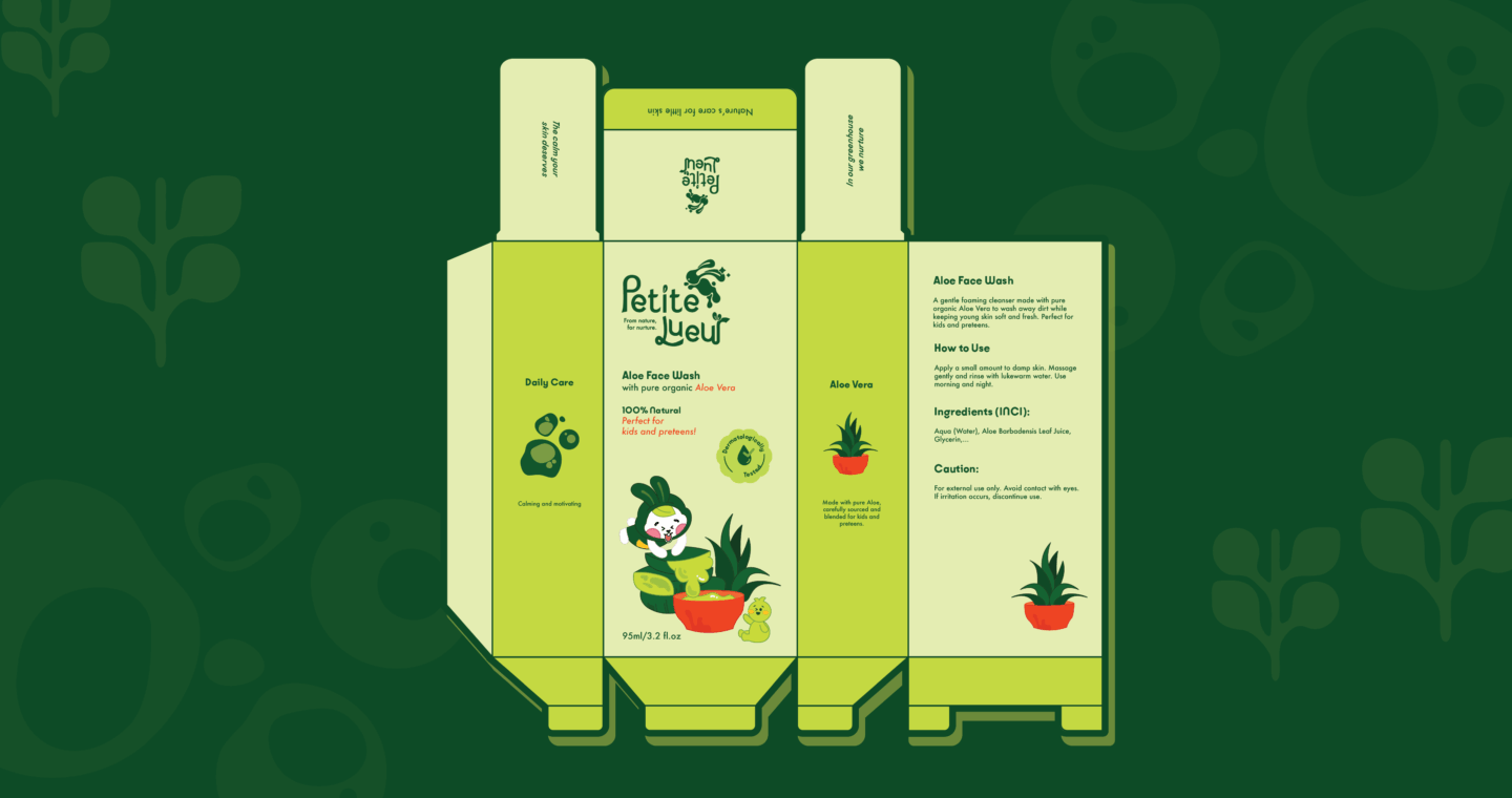
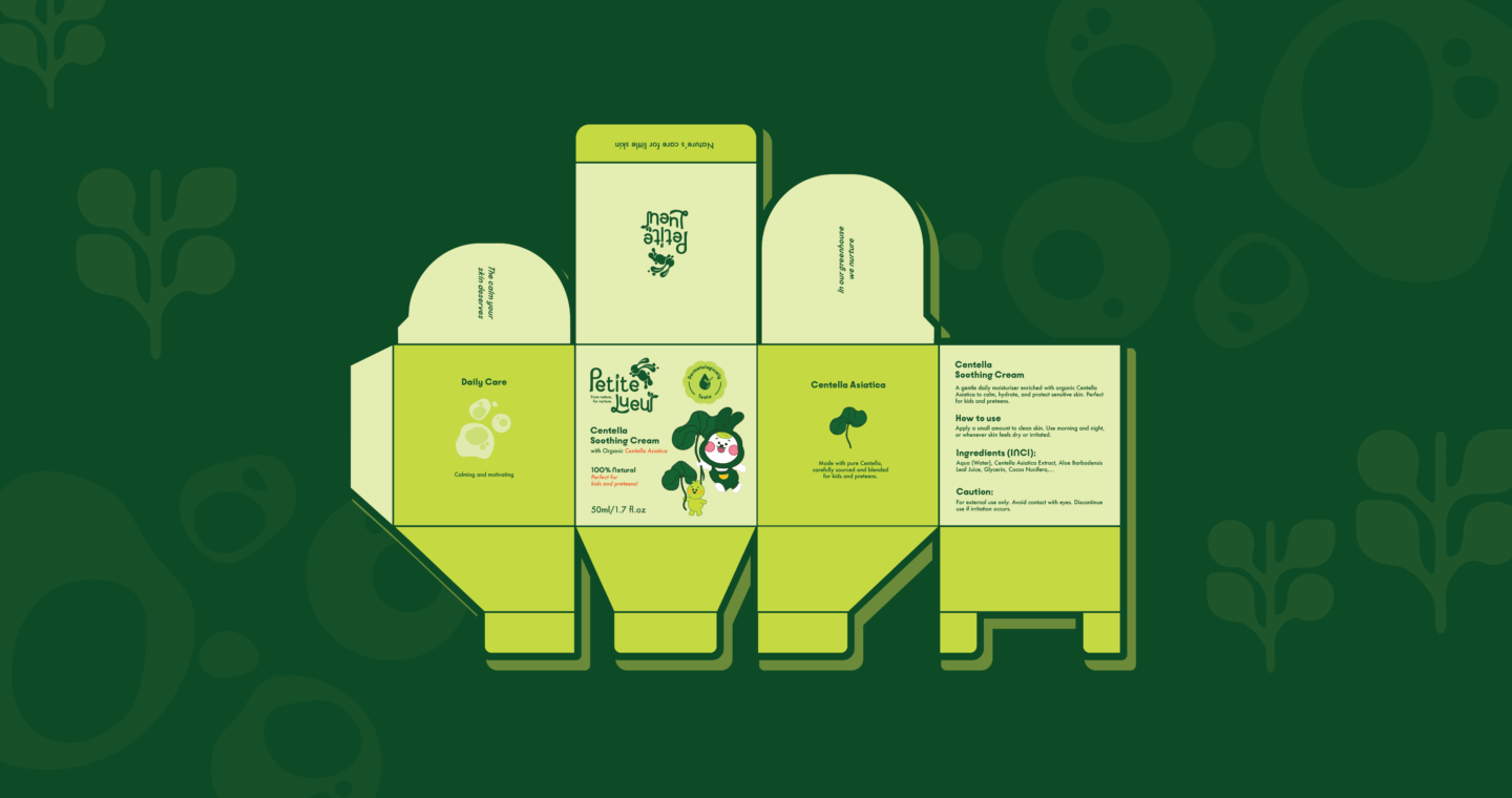
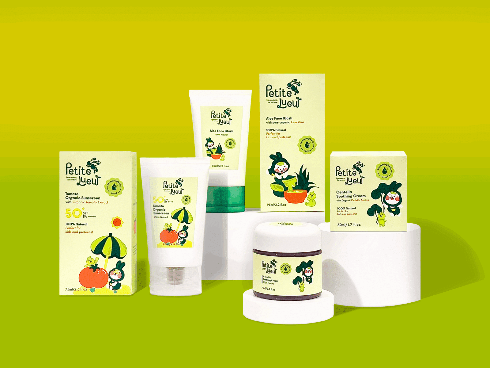
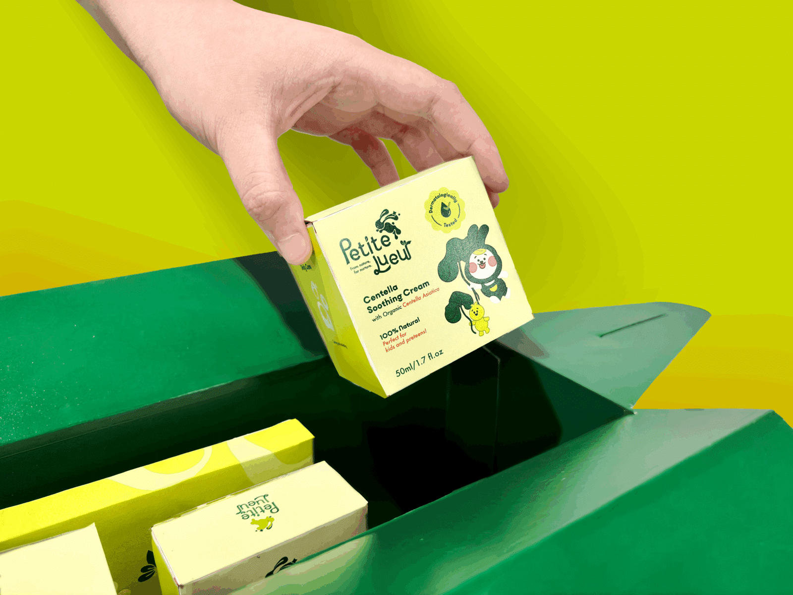
The individual product packaging makes effective use of negative space to achieve a clean and balanced layout. Brand icons are applied across multiple panels to enhance visual consistency, while thoughtful messages and values are integrated into the inner flaps, creating a memorable unboxing experience from the very first opening.
Gift box
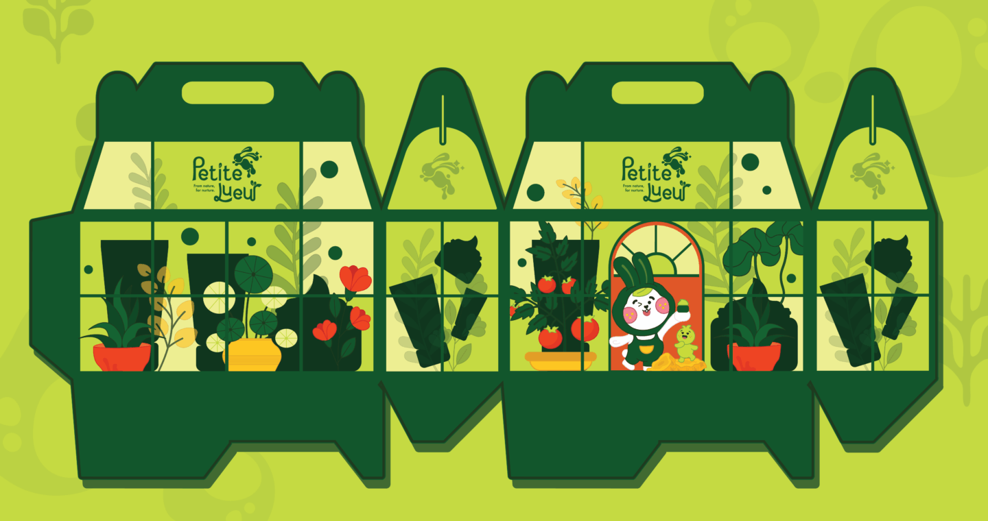
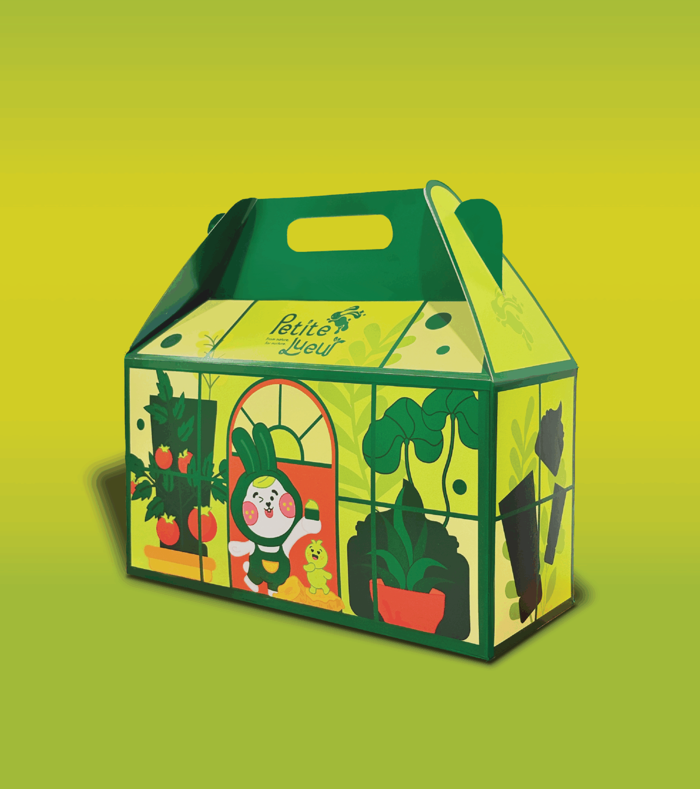
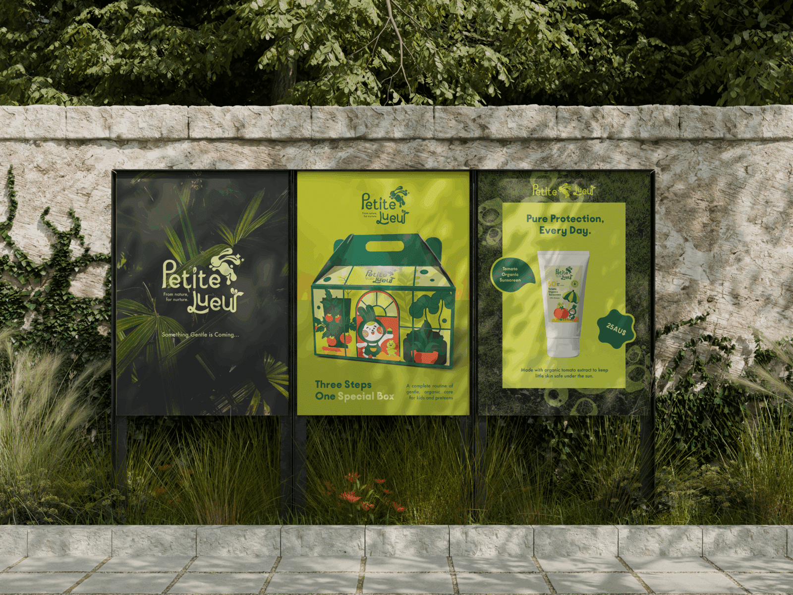
The gift box is designed to evoke a sense of imagination and storytelling. Shaped like a greenhouse, the structure represents Petite Lueur’s origin – where care begins and nature thrives. The combination of soft structural lines and playful illustrations creates an engaging unboxing experience that feels both premium and delightful. Inside the box are three key skincare products, a brochure introducing the brand, and a set of illustrated stickers.
advertising pOSTERS
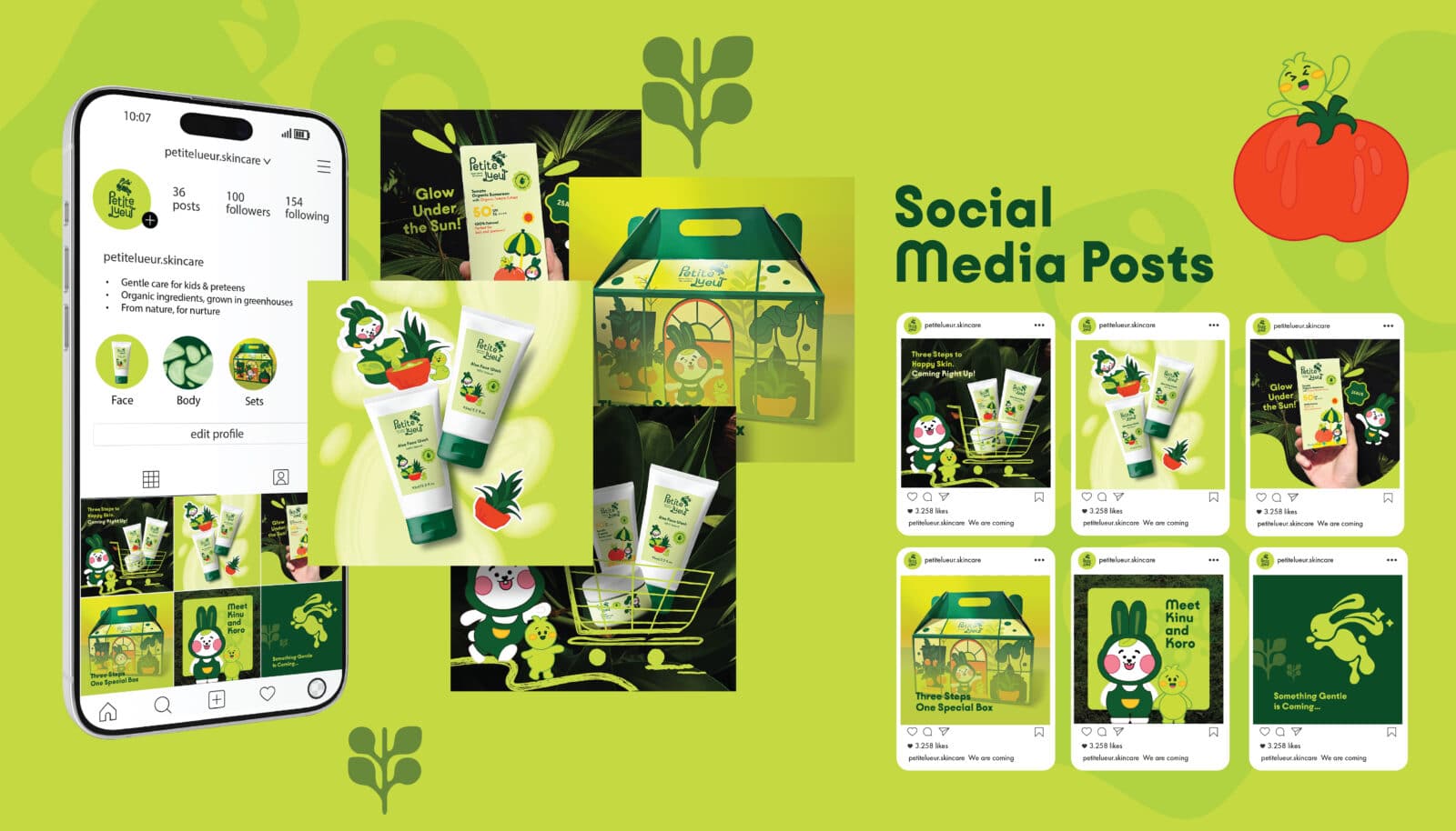
SOCIAL MEDIA POSTS
The social media posts extend the brand’s playful tone into digital spaces. Featuring the mascots and color palette, each post highlights key products and values while maintaining an engaging and cohesive visual presence across platforms.
WEBSITE
The Petite Lueur website brings the brand’s gentle and nurturing identity into a digital experience that feels warm, inclusive, and easy to use. The design uses a high contrast ratio for better readability and accessibility, paired with a neutral color palette that avoids gender bias and feels welcoming to everyone. Friendly illustrations of Kinu and Koro guide users through the pages, creating an engaging and educational experience for kids and preteens while maintaining trust and clarity for parents. Clean layouts and clear navigation enhance usability and reflect the brand’s key values: gentle, organic, trustworthy, and playful.
Explore more details on my Behance page
