Visual Communication - Bachelor
Tipsy Tins
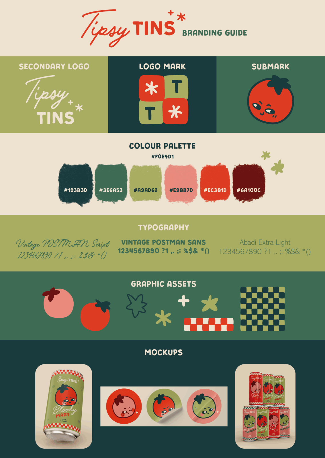
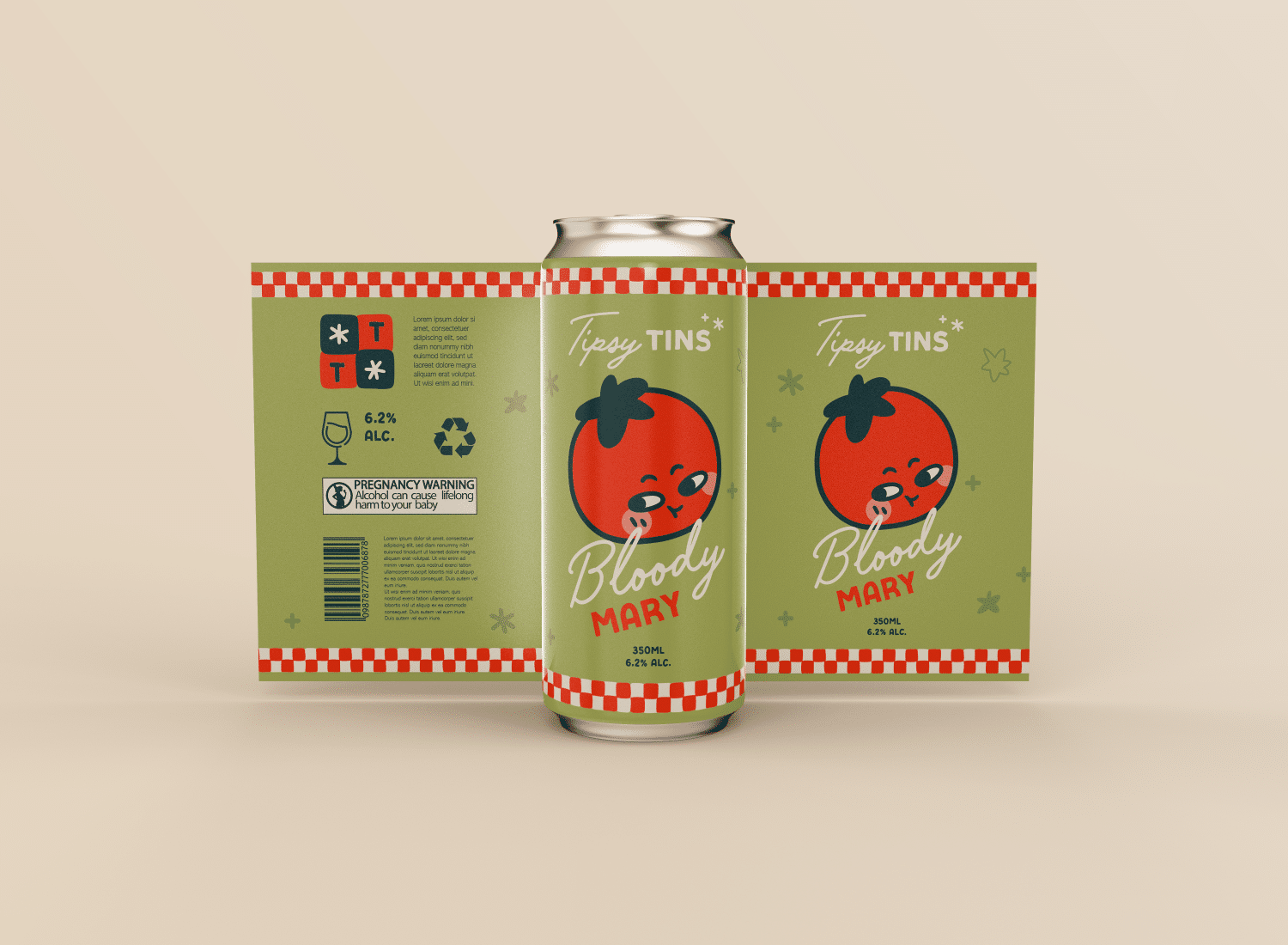
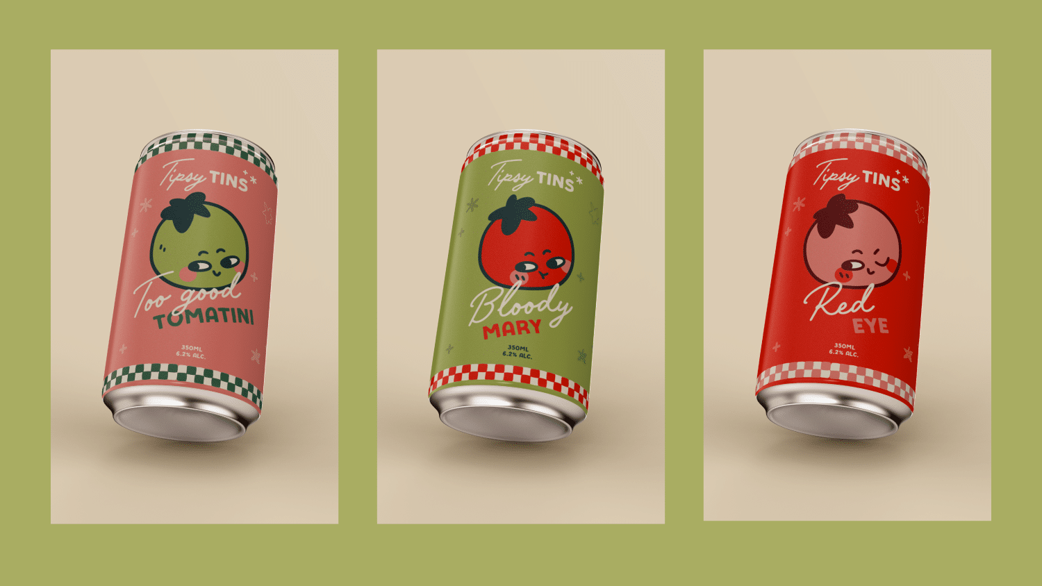
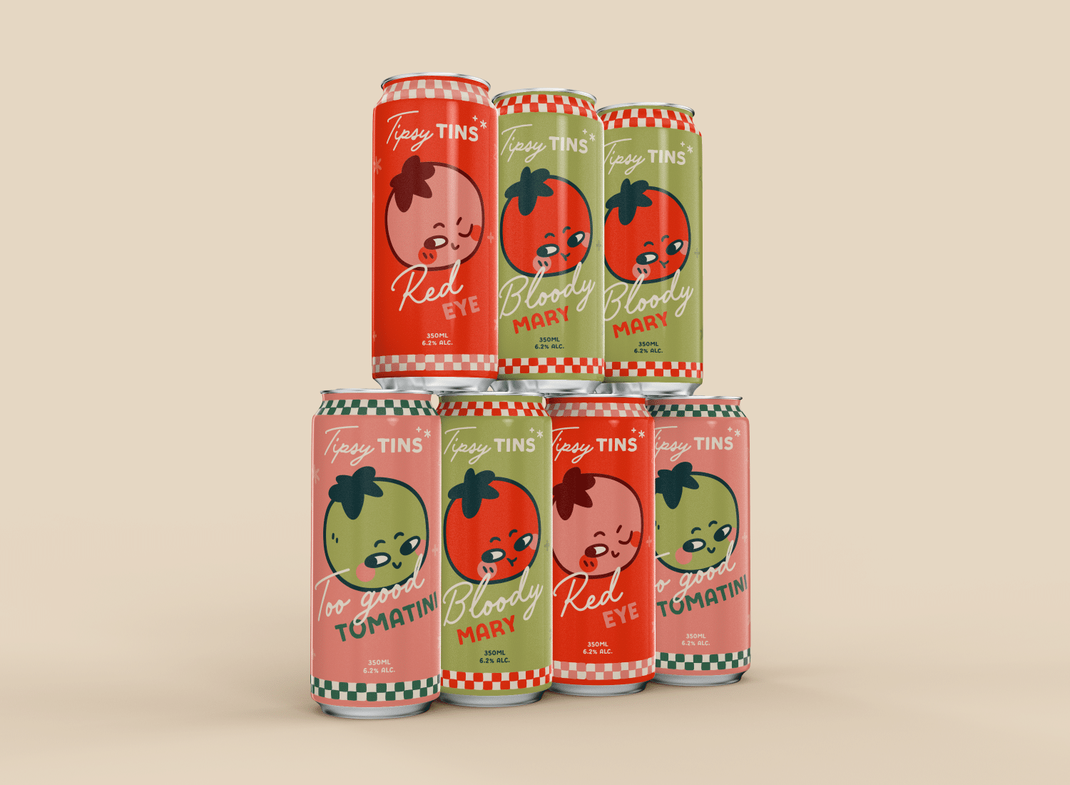
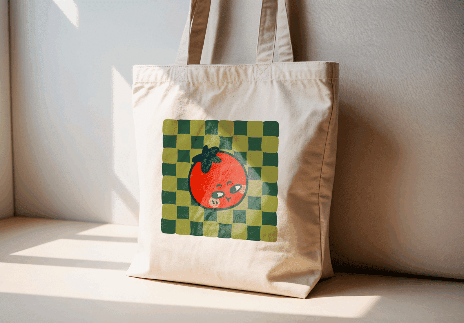
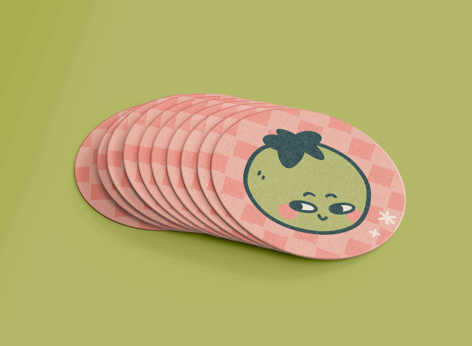
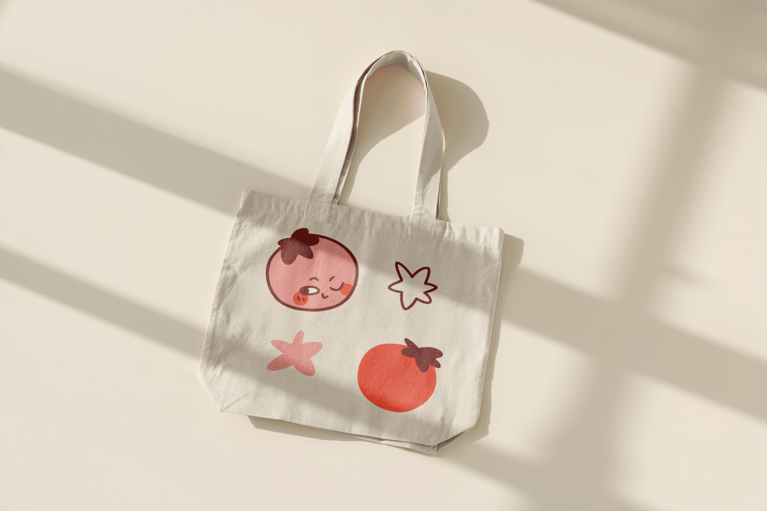
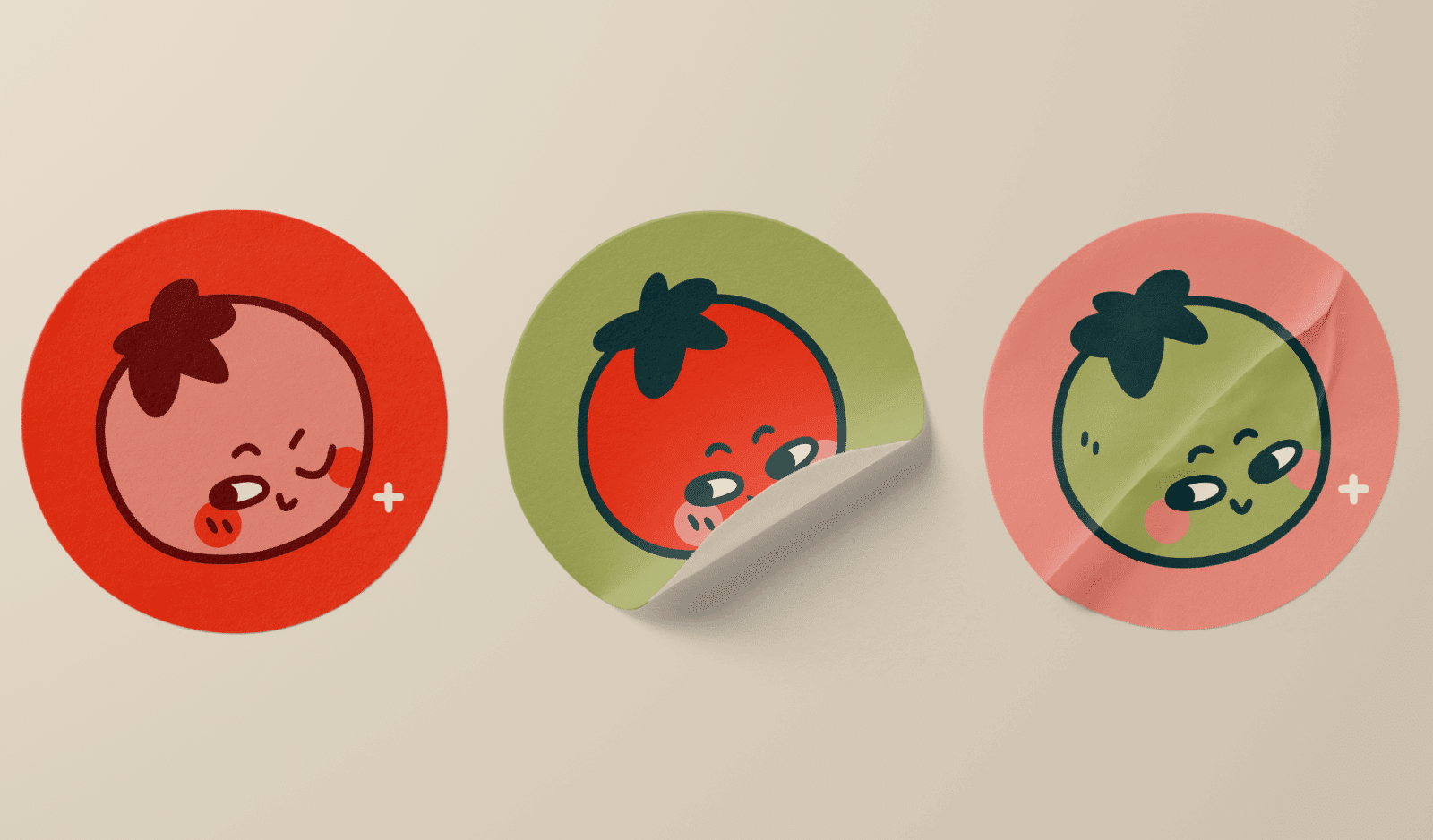
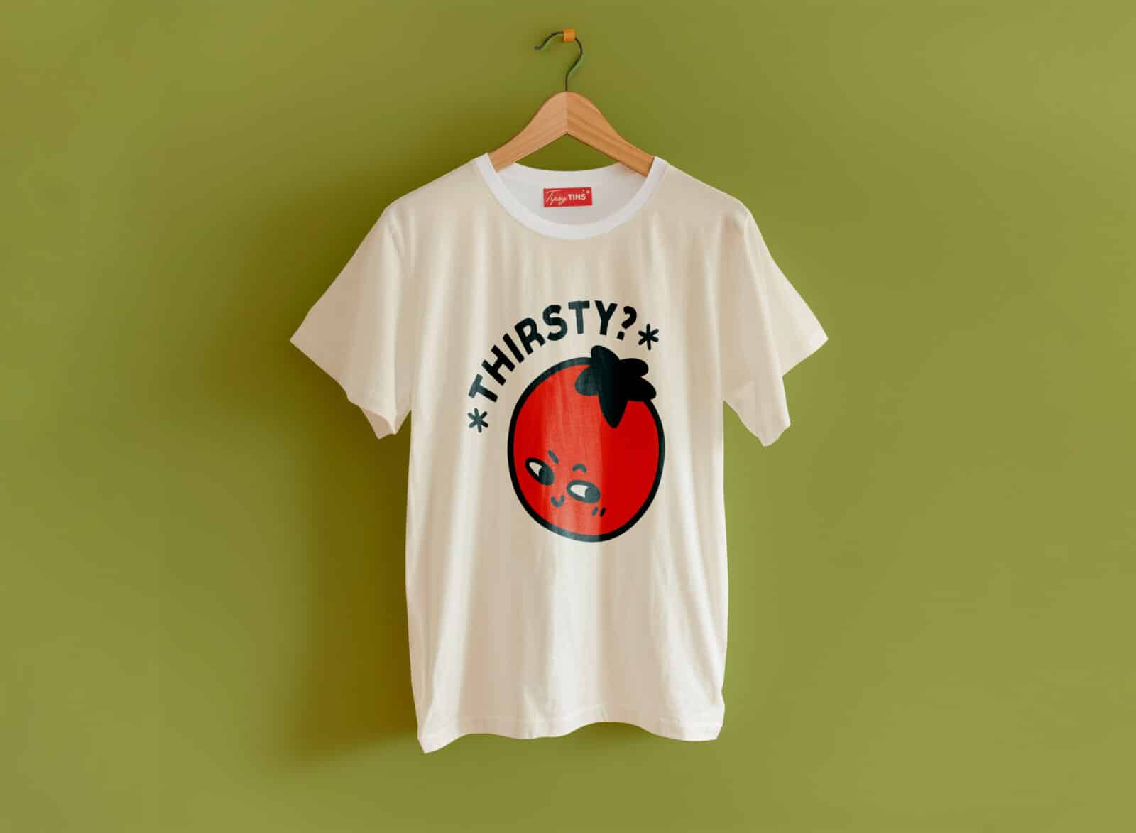
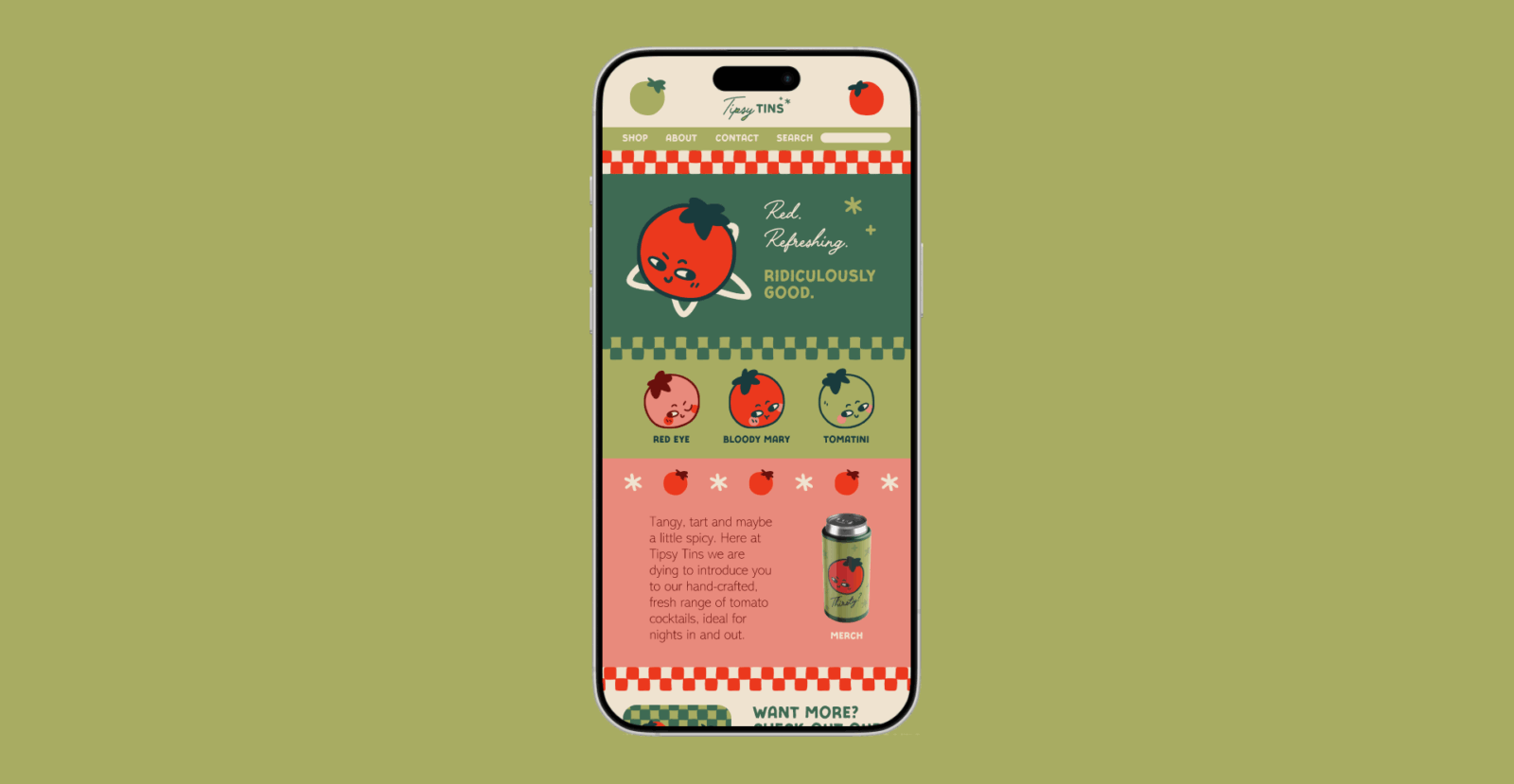
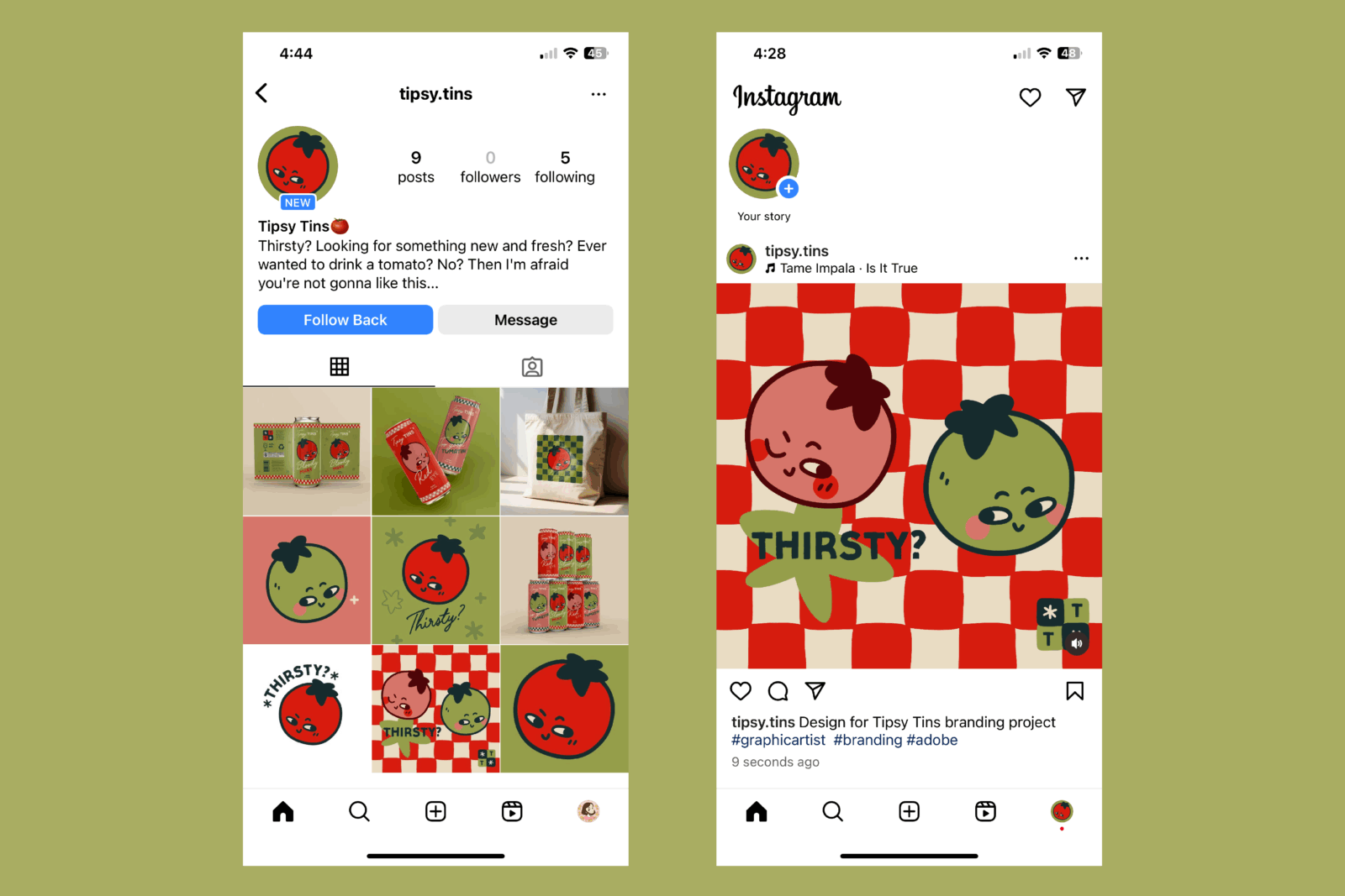
This project is about introducing a fresh and exciting range of drinks to those wanting something out-of-the-ordinary for their Friday afternoon sesh. Ever wanted to sit back and relax with an ice-cold Bloody Mary? No? Well then, I’m afraid this isn’t for you. The brand identity of Tipsy Tins is based on tomatoes and inspired by vintage art and print design. The colour palette, logomark, graphic assets and other artwork are all inspired by—you guessed it—tomatoes. A key part of the aesthetic is the hand-drawn feel, designed to create a rustic and authentic look.
